
Scaling a 30+ module enterprise SaaS into a unified, AI-enabled workflow platform used by 2M+ users.
B2B SaaS Platform
Web & Mobile (iOS & Android)
London, UK
Role summary
Head of Product Design (nearly 7 years).
Led design across 30+ modules (Web + iOS/Android).
Built design system from zero (YOBI, 200+ components).
Shipped at speed with engineering and improved design-to-dev quality.
Role Overview & Outcomes
My Role
Led design across 30+ modules for 2M+ users
Design system (YOBI): 200+ components across 6 libraries
Results
35% faster task completion via redesigned workflows
+40% training engagement with AI-powered learning (NEO)
25% reduction in onboarding time through UX overhaul
Executive Impact (at scale)
A snapshot of platform-level outcomes across product, systems and delivery.
Scale & Complexity
Platform scale — 2M+ users across 80+ countries
Enterprise adoption — 350+ global brands
Product surface — 30+ modules across Web + iOS/Android
Efficiency & Engagement
Workflow efficiency — 35% faster task completion
Learning impact — +40% training engagement (NEO)
Time-to-value — 25% reduction in onboarding time
Foundations & Delivery
Design system — YOBI: 200+ components across 6 libraries
Consistency — unified navigation & patterns across modules
Execution quality — reduced the 20–30% design–dev gap via specs, handoff and QA
Operating in Ambiguity (Founder-Mode)
- Built from zero: set standards, cadence, and quality bar (no templates / no red tape).
- Distilled complexity into clarity: unified navigation and patterns across modules.
- Shipped fast with engineering: tightened specs, handoff and QA to reduce design–dev gap (~20–30% previously).
- Scaled systems: reusable patterns and component library to increase delivery speed without sacrificing craft.
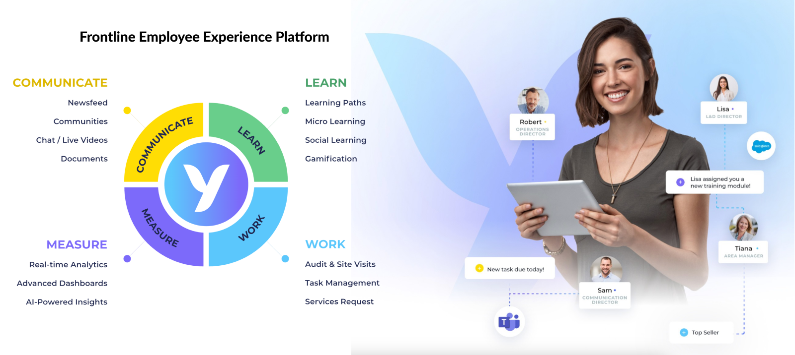
What is YOOBIC?
YOOBIC is a unified web and mobile platform for frontline teams in retail, hospitality, and manufacturing. Used by 2M+ users across 80+ countries and 350+ brands.
Core pillars:
- Operational Execution — Task management, checklists, audits, and store visits for consistent execution across locations.
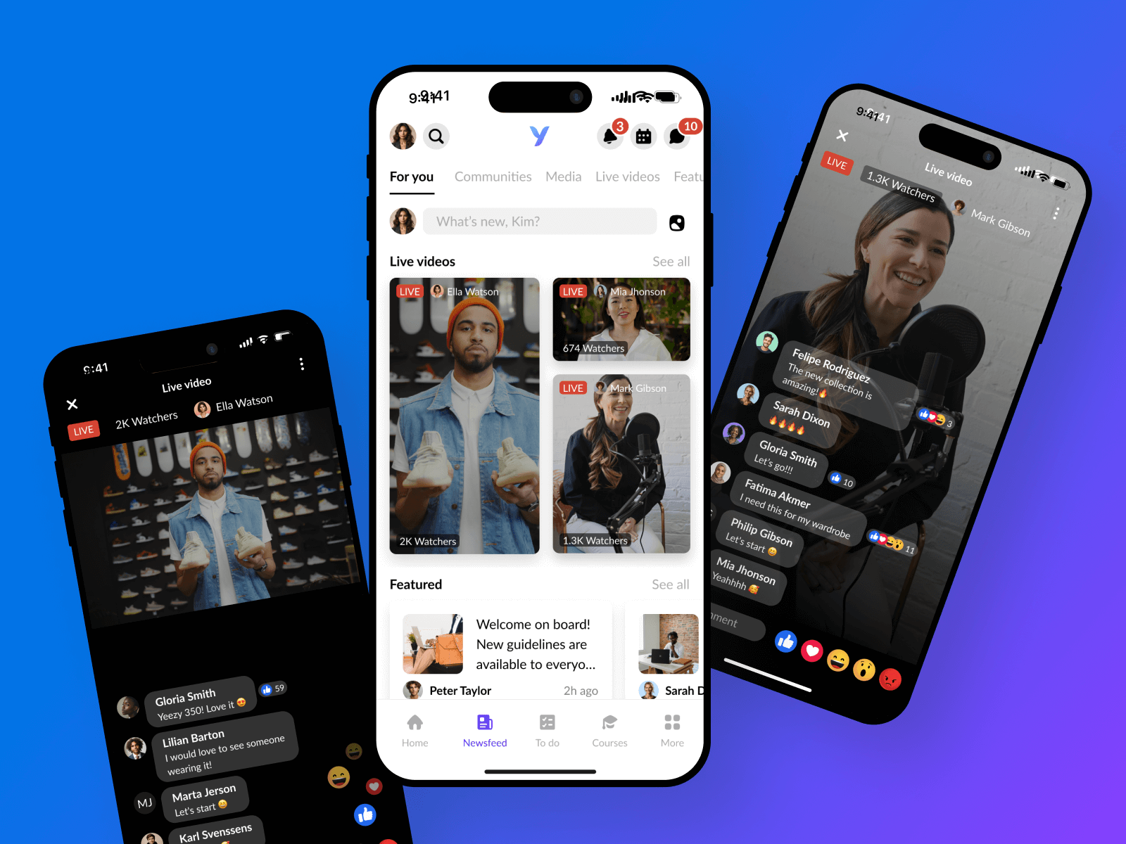
- Internal Communication — Real-time chat, announcements, live video, and social feeds to connect teams.
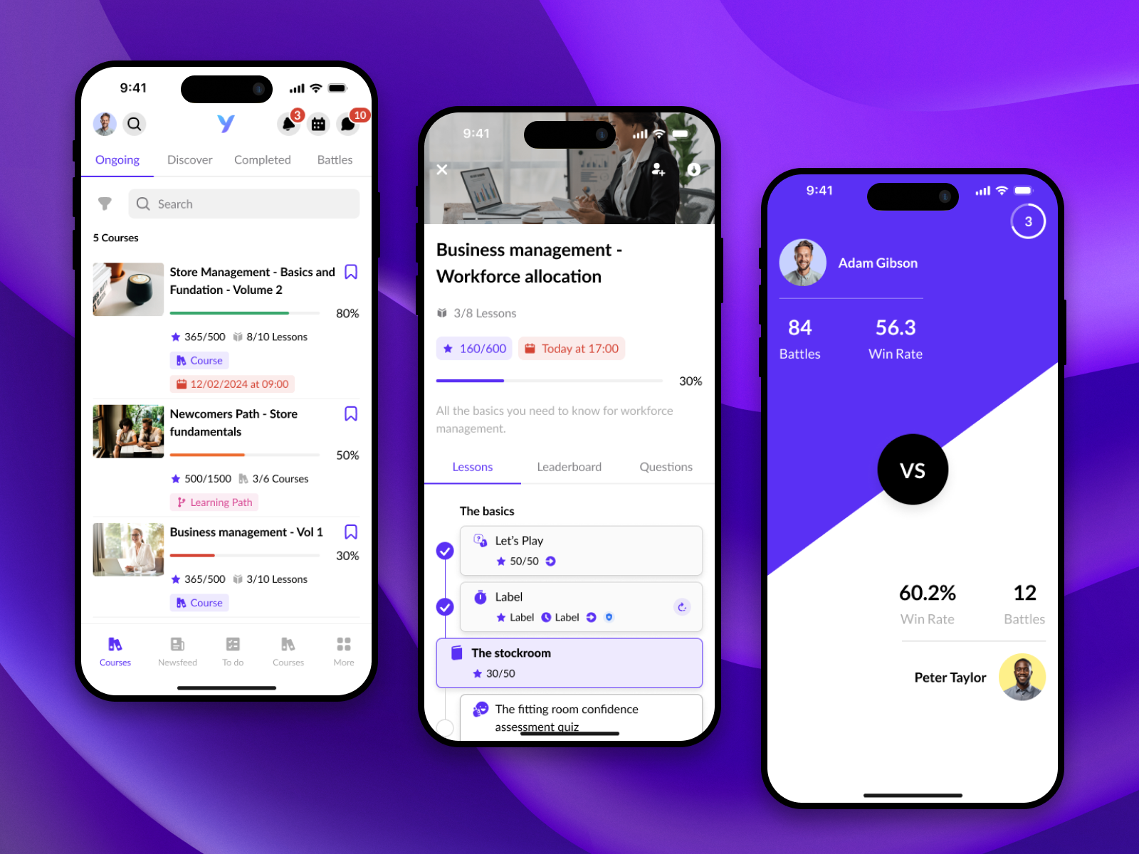
- Learning & Development — Gamified microlearning, mobile onboarding, and upskilling tools for the field.
The Initial Problem

When I joined YOOBIC in 2018, the platform was already packed with features—over 30 modules spanning task execution, communication, and learning. But despite its functional richness, the experience was fractured.
There was no real navigation structure, making it extremely hard for users to move between modules or understand where they were in the system. The user journeys felt disconnected, inconsistent, and inefficient—especially for a platform aiming to serve global frontline teams at scale. Usability issues multiplied as new features were layered on top of an already complex ecosystem.
At the same time, I was tasked with three critical initiatives:
- Designing the mobile app for the Work pillar (task management, forms, checklists) from scratch
- Building the design system from zero, which I later named YOBI
- Scaling the design team, aligning product, design, and engineering under a shared vision
The challenge was not just about redesigning screens—it was about bringing structure, clarity, and coherence to a fragmented product experience, while laying the foundation for sustainable growth across both product and team.
Objectives & Goals


When I joined YOOBIC, one of my first priorities was to define a clear and cohesive design vision for the platform. The product was growing fast, but without a solid UX strategy or design leadership in place, there was a real risk of creating inconsistent and fragmented experiences.
I knew we needed to structure the design team, not just in terms of people, but also in terms of process and culture. My goal was to shift the company towards a more user-centric mindset, where design was not just about how things looked, but how they worked and solved real problems for frontline employees and admins.
Another major objective was to create a scalable experience across both web and mobile. We had several modules—Work, Communicate, Learn—each evolving independently. It was essential to bring consistency and coherence across all touchpoints.
At the same time, I focused on improving the collaboration between design and development. Too often, we were facing a 20–30% gap between design and what was shipped. I wanted to close that gap through clearer specs, better handoffs, and shared language between designers and engineers.
Finally, I took full ownership of building and scaling our design system—starting from scratch and eventually delivering a robust system with 200+ components, used across all our product teams.
UX Approach

RESEARCH & DISCOVERY
- Conducted user interviews and on-site observations across industries like retail, grocery, pharma, and hospitality to capture different operational contexts.
- Analyzed behavioral analytics and support tickets to identify patterns in navigation errors, drop-offs, and feature misuse.
- Reviewed competitor platforms to benchmark best practices in communication, task management, and learning modules.
- Created personas for two main user groups: Frontline Employees (store staff, warehouse workers) and Managers/Head Office (regional managers, HQ teams).
- Mapped current workflows in collaborative sessions, highlighting industry-specific challenges and translating them into design opportunities.

DEFINITION & IDEATION
- Mapped end-to-end user journeys for each persona to surface major friction points like excessive scrolling, poor discoverability, and redundant features.
- Defined core components and interaction patterns to unify the platform experience across Work, Communication, and Learn pillars.
- Designed the YOOBIC Design System — 200+ reusable components across 6 Figma libraries with documentation, naming conventions, and accessibility standards.
- Applied progressive disclosure for complex tasks like onboarding, training, and task approvals to improve completion rates.
- Introduced role-based layouts and modular Newsfeed configurations to adapt to different clients and operational needs.

DEPLOYMENT & ITERATION
- Collaborated with engineering to integrate the Design System directly into the codebase, reducing design–dev inconsistencies and speeding delivery.
- Implemented pixel-perfect QA and design handoff processes to minimise production errors.
- Rolled out incremental feature updates starting with high-traffic areas like the Newsfeed and Task Manager.
- Established a feedback loop with clients and internal teams to validate design changes in real-world use cases.
- Refined through iterative usability testing, continuously improving based on data and qualitative feedback.
Research & Insights

My research combined multiple methods, including user interviews, analytics review, competitor benchmarking, and usability testing, to gain a clear understanding of how the platform was used in the real world.
Through these efforts, we discovered that users often struggled to locate and complete key tasks due to complex, inconsistent navigation patterns. Many workflows were slowed by overlapping or redundant features, while the absence of a unified design standard increased development time and created more QA issues.
Because YOOBIC serves a diverse range of industries — from retail and pharma to grocery, hospitality, and manufacturing — the scenarios and contexts in which the platform is used vary widely. This made it critical to design for flexibility and scalability.
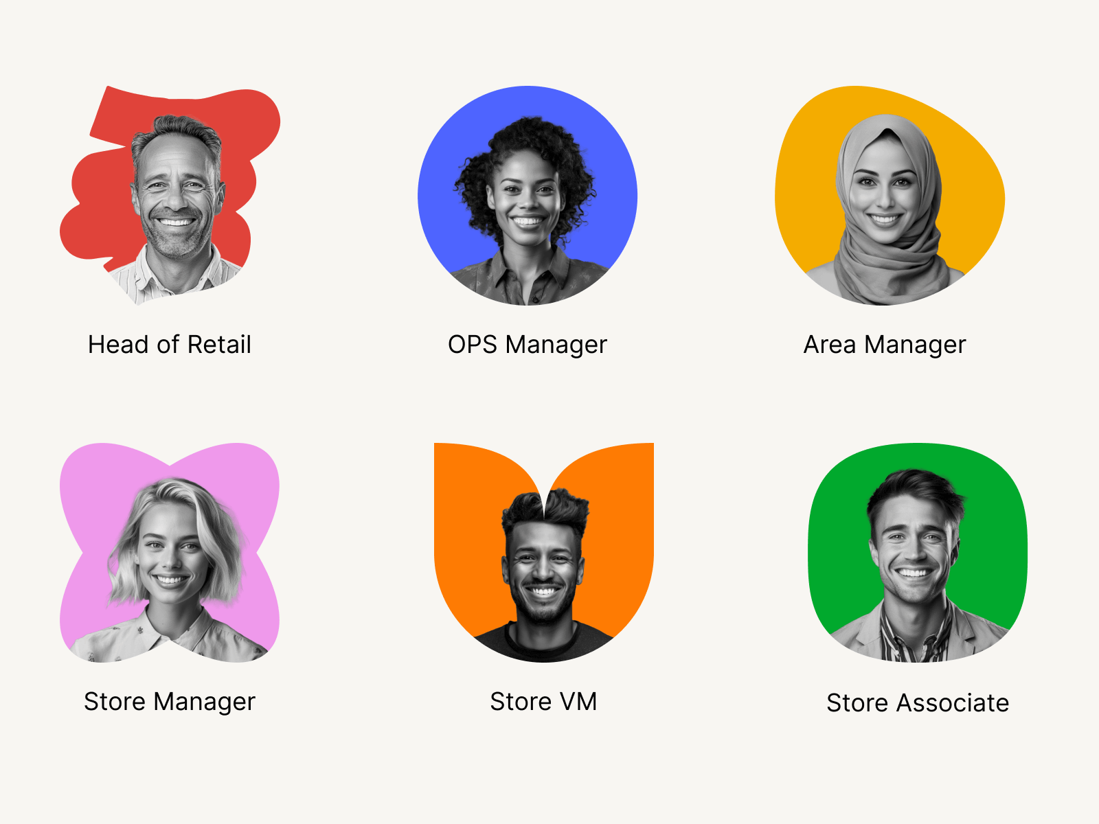
Our research identified two primary personas with distinct needs and workflows:
- Frontline Employees: typically mobile-first users who require quick, guided access to tasks, training, and communication tools while on the go.
- Managers & Head Office Staff: often using desktop or tablet, focusing on oversight, reporting, and operational management across multiple locations.
Designing for these two groups meant balancing speed and simplicity for frontline workers with depth and control for managers, without compromising usability for either.
Design Strategy & Process
The redesign followed a structured, iterative design process to ensure every solution was validated and grounded in user needs.
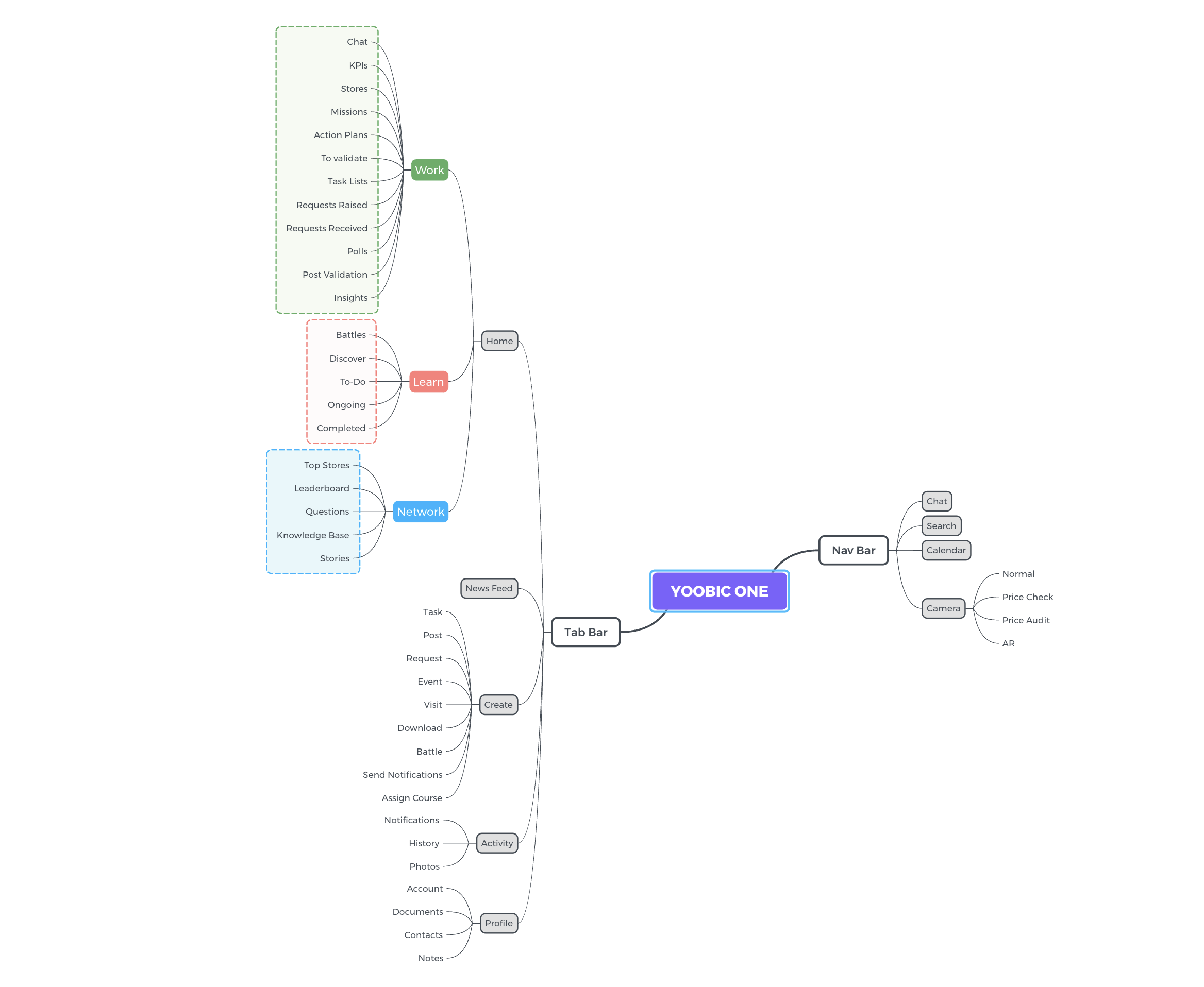
• Mind Mapping & Workflow Mapping – Started by mapping the entire YOOBIC ecosystem, breaking down how Work, Communication, and Learn modules connected for different industries. This helped uncover bottlenecks in navigation and identify redundant flows.
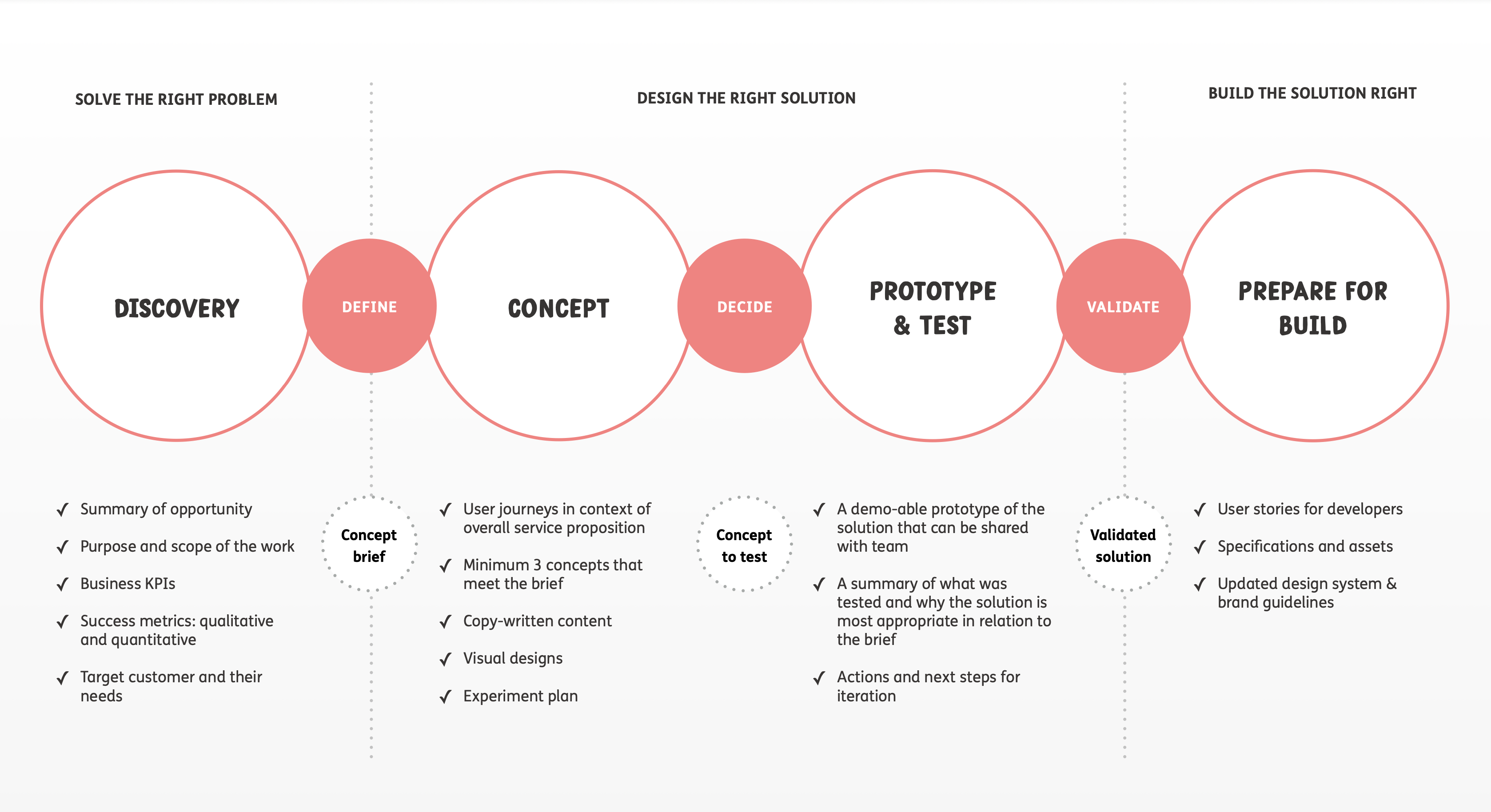
Low-Fidelity Wireframes – Created quick sketches and wireframes to explore multiple navigation layouts and Newsfeed configurations before committing to a visual direction.
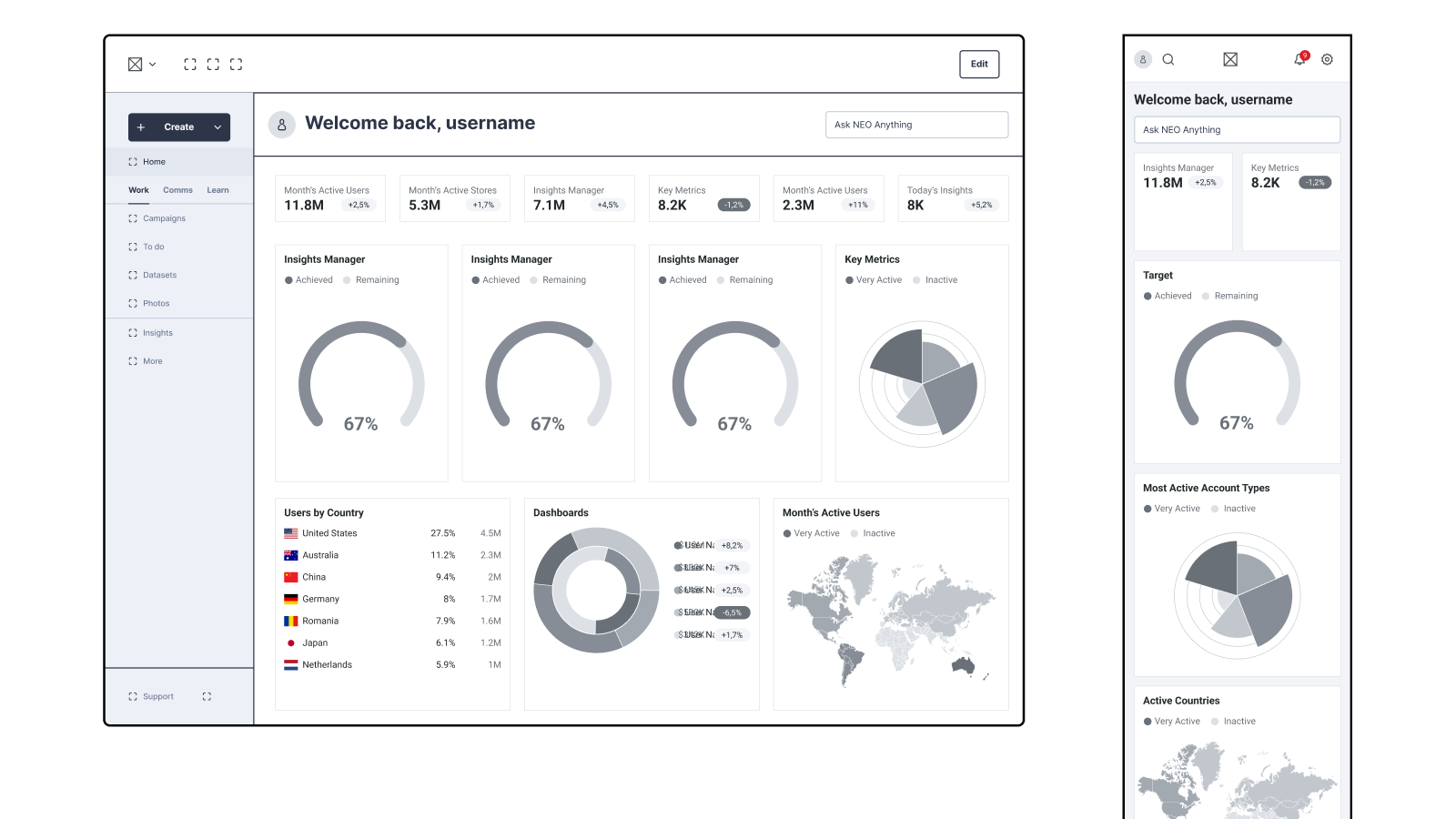
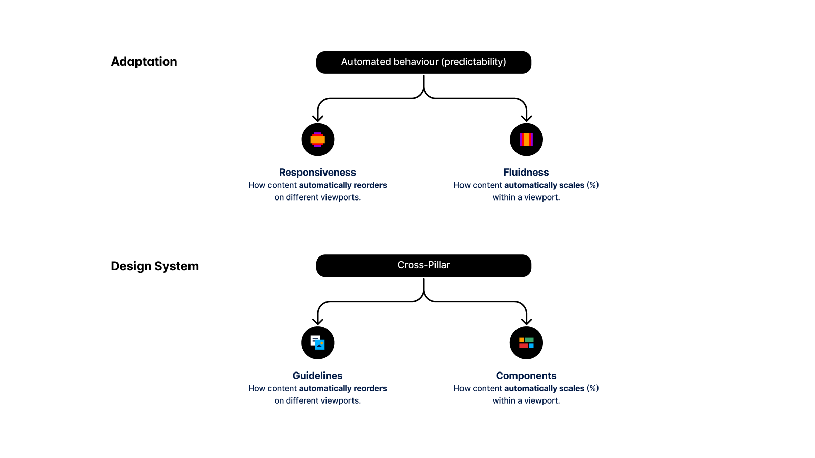
High-Fidelity UI Design – Built polished, pixel-perfect screens in Figma, applying the YOOBIC Design System for typography, spacing, iconography, and component consistency.
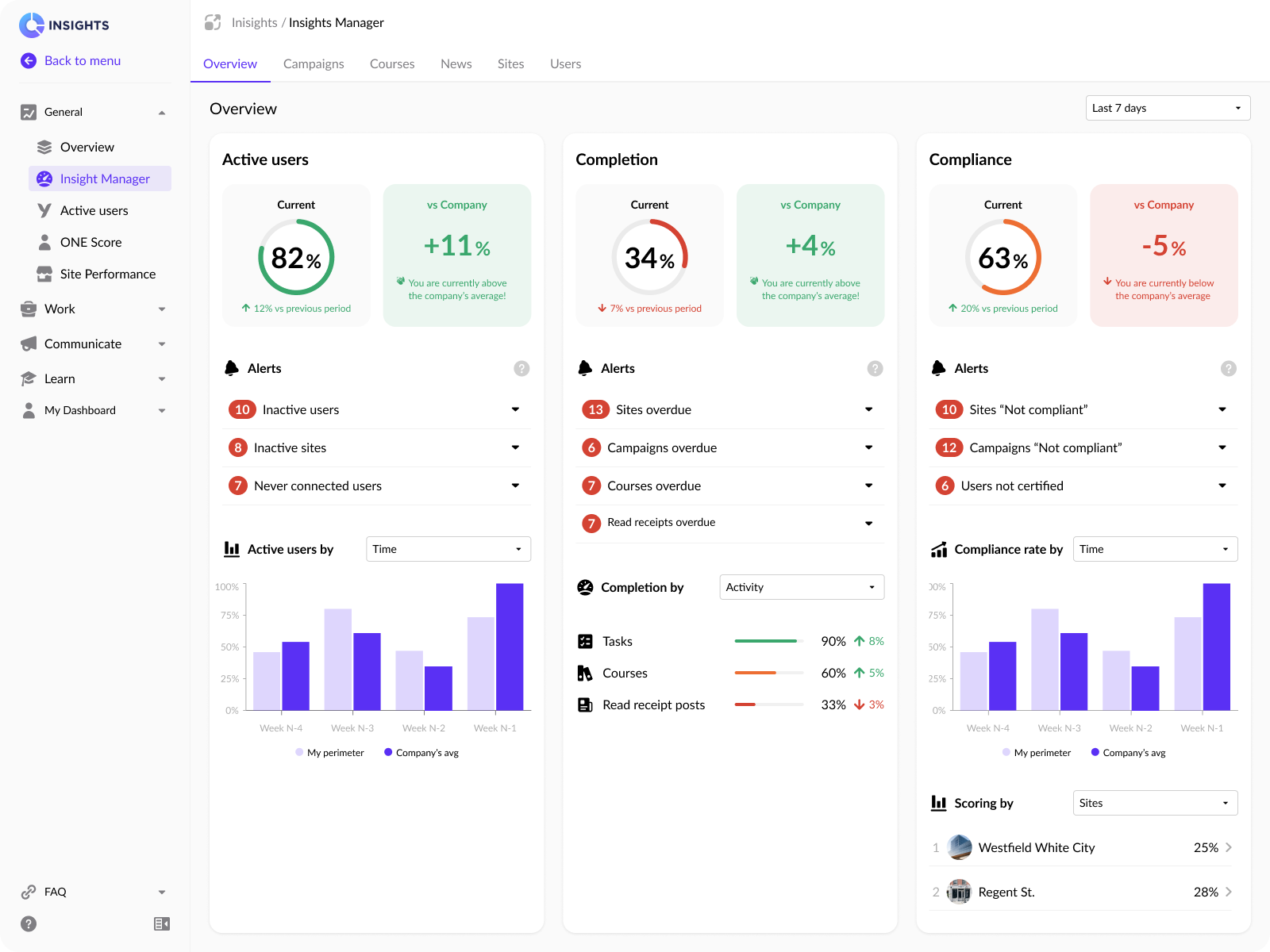
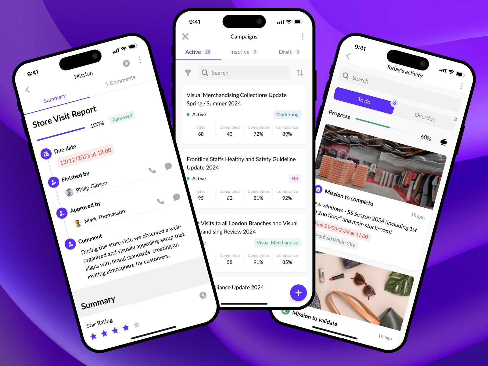
1. Efficient Task Management
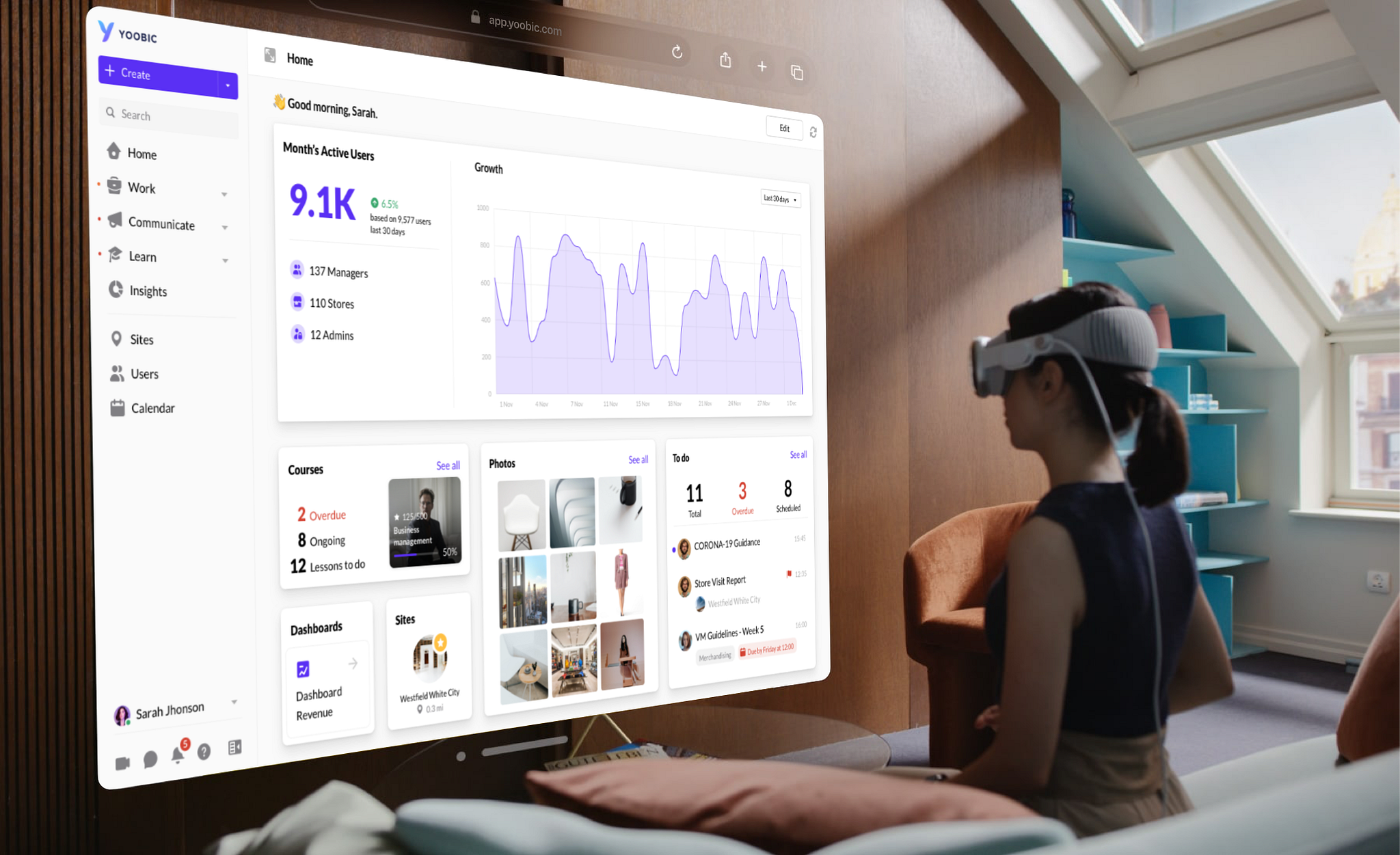
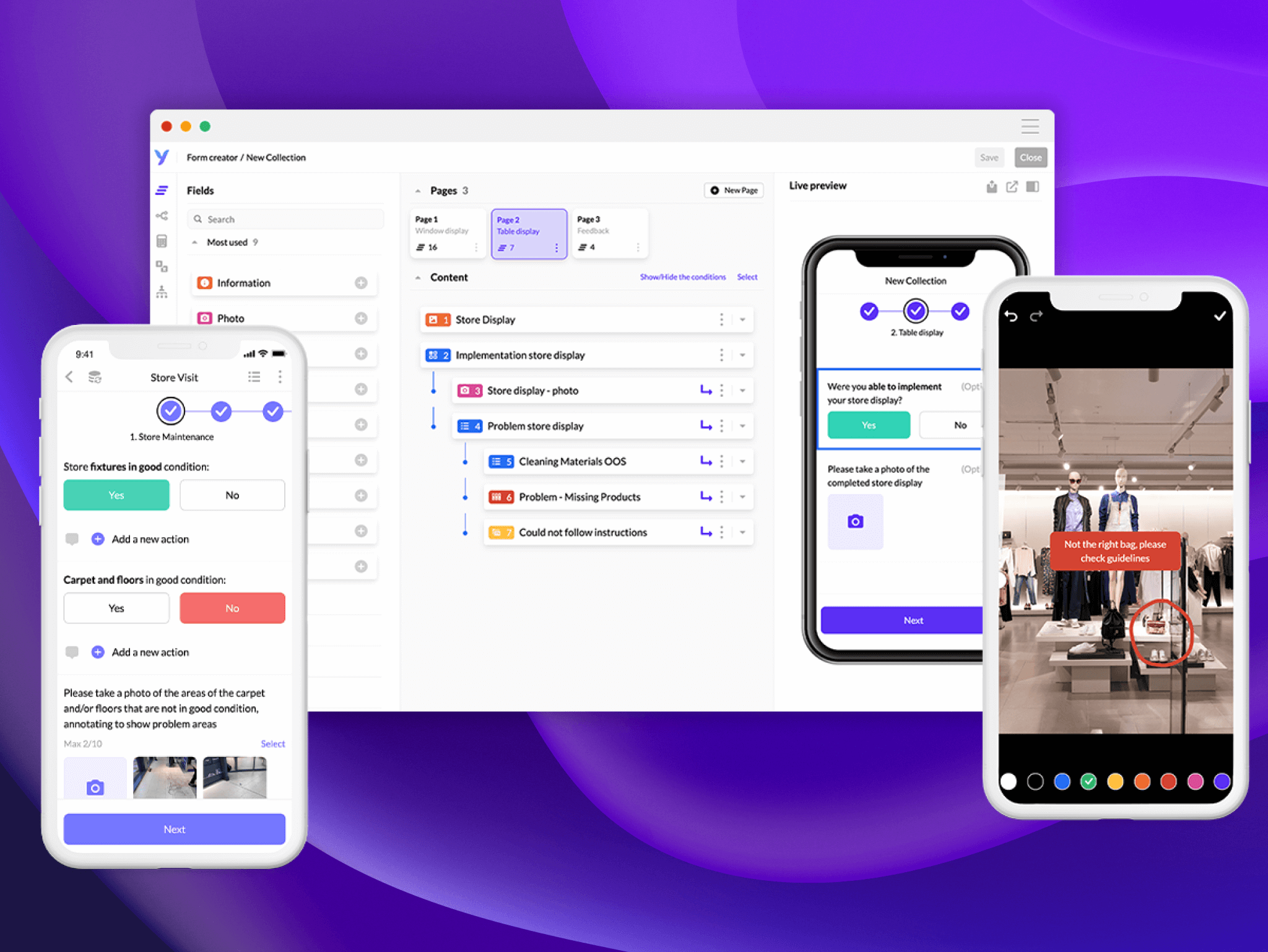
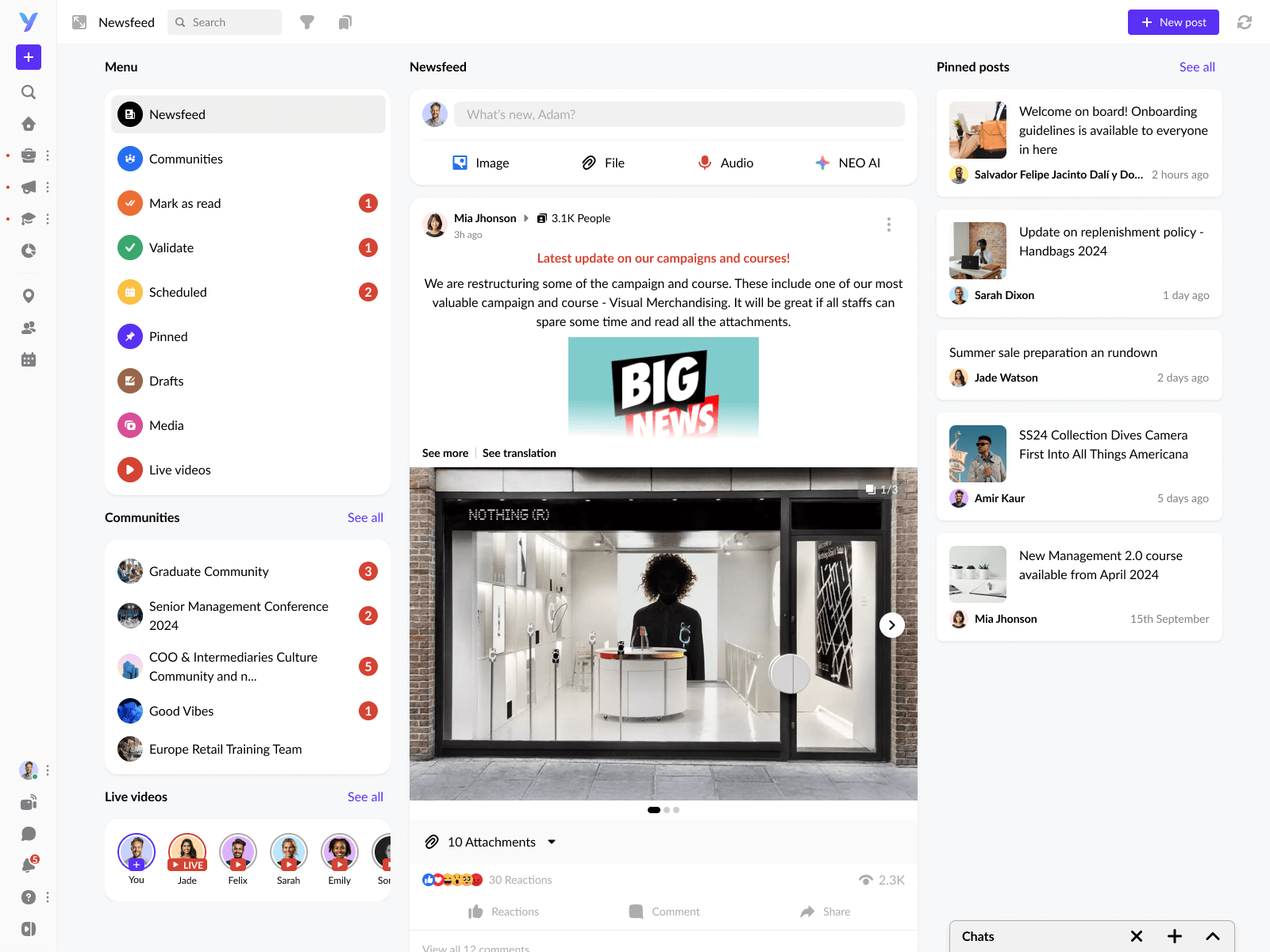
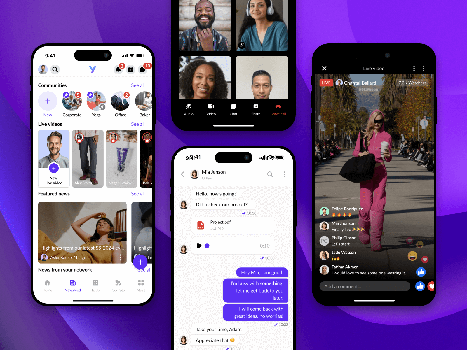
2. Employee Engagement

3. Enhanced Micro-Learning & Training

User Feedback & Iterative Design
We continuously iterated with feedback loops from real users across global markets. A/B testing, session replays, and interviews shaped every major feature launch.
Impact on YOOBIC's Growth
My work played a key role in YOOBIC’s growth from a European startup to a global player in the frontline tech space — with a more intuitive, powerful, and scalable user experience at the heart of it.