3TX — Workforce Competence Platform
Rebuilding the Home experience and establishing a scalable Design System for a B2B compliance & competence platform.
Lead Designer — Contract
London · May–Aug 2025
Client: 3t Global (3TX Digital)
As Lead Designer (contract) at 3t Global, I redesigned the 3TX Home experience to help safety-critical organisations manage training, competence and learning delivery in one unified platform—reducing admin load while improving real-time visibility for compliance and workforce readiness.
What is 3TX?
3TX is a single, unified platform designed to manage training, competence, and learning delivery—built to support safety-critical industries where compliance, visibility, and operational readiness are essential. The product helps teams automate reporting and notifications, adapt workflows as organisations evolve, and access real-time insights through configurable dashboards.
The Context
When I joined, the platform experience was fragmented across modules and inconsistent in UI patterns. Admin users—often responsible for compliance oversight—had to navigate multiple areas to identify risk, spot gaps, and trigger actions. The Home screen in particular lacked a clear “command centre” view to support day-to-day operational decision making.
- Fragmented UX across modules
- Dated UI and inconsistent patterns
- Low clarity for admins
- Manual-heavy workflows
- No scalable design system
The Challenge
From “information” to “action”
In safety-critical environments, competence gaps and expired certifications can directly impact operational risk. Admins needed faster visibility over gaps, clearer action points, and a shorter time-to-task—without jumping across multiple menus. The goal was to turn the Home experience into an operational hub: real-time insights + immediate next actions.
- Fast visibility over compliance gaps
- Clear action points from KPIs
- Reduced time-to-task
- Less navigation across multiple areas
Discovery & Research
UX audit, structure mapping, and role complexity
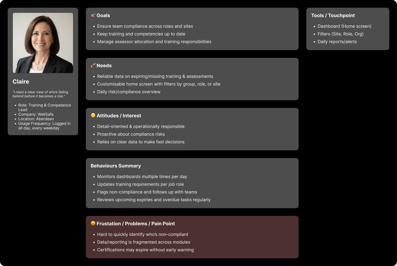
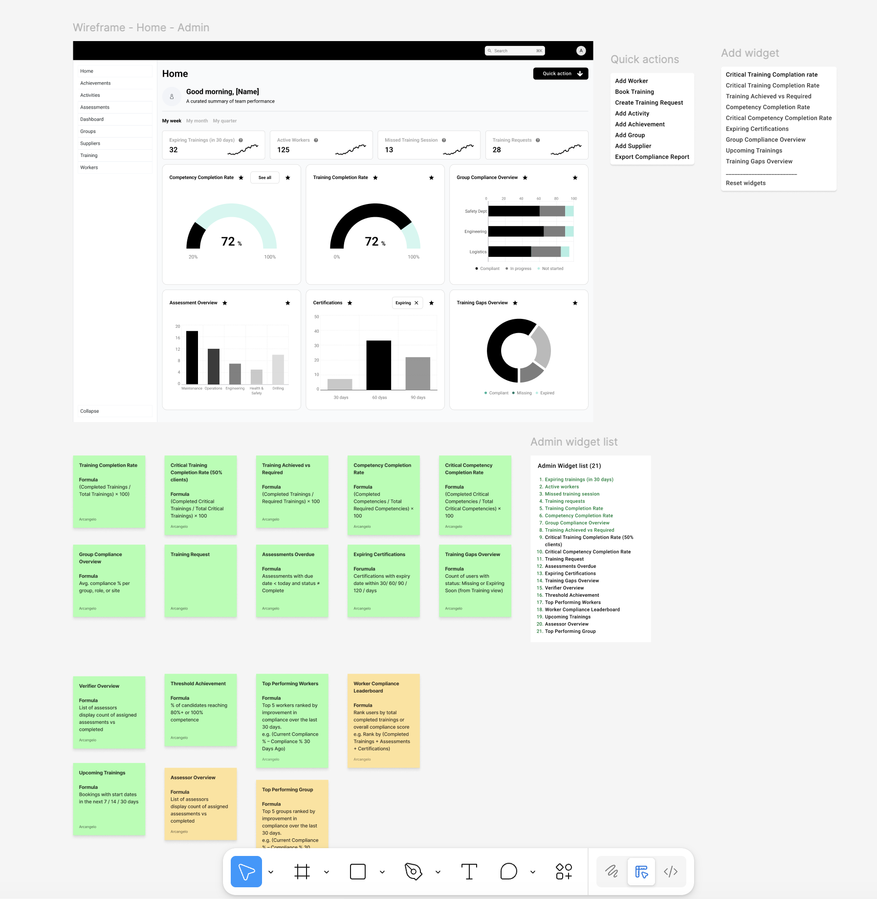
I mapped the Home architecture and role-based needs to define a scalable information hierarchy. The new Home structure required: a clear top bar and quick actions, a welcome summary, filters, fixed KPI tiles, an attention/to-do zone, a flexible widget area, support links, and a persistent side menu.
To reduce context switching, I also mapped role complexity across Admin, Worker, Assessor, and Verifier journeys—identifying where users were forced into duplicated flows and repeated navigation across Training, Assessments, Achievements, Competence, Groups, and Workers.
Competitor Benchmarking
I benchmarked 3TX against other competence and workforce training platforms to understand baseline expectations and differentiation opportunities.
Common ground
- Training matrices and competence tracking
- Compliance oversight and reporting/export
- Integrations (LMS / SCORM expectations)
Market gaps
- Strong real-time readiness dashboards
- Proactive gap detection (automation/AI)
- Clear visual role progression
Opportunity: design an experience that supports both power users and occasional users, with configurable dashboards that surface risk and next actions.
Strategy
I focused on a Home experience that mirrors how admins actually work: identify risk, prioritise, and act—fast.
- Redesign the Home as an operational command centre
- Introduce role-based widgets and configurable insights
- Reduce time-to-task with actionable KPIs and quick actions
- Build foundations of a scalable design system (Elevate)
The Solution — Home Redesign
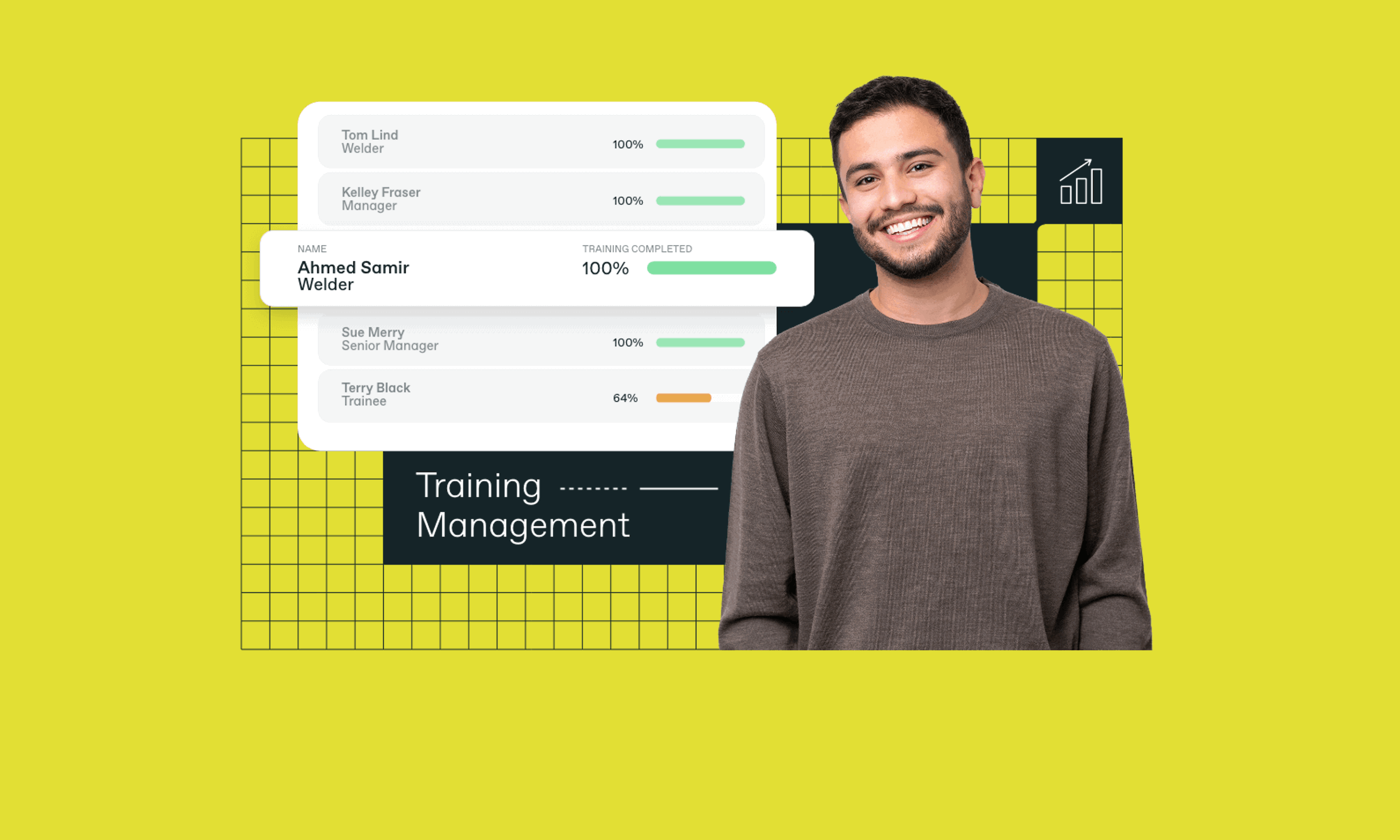
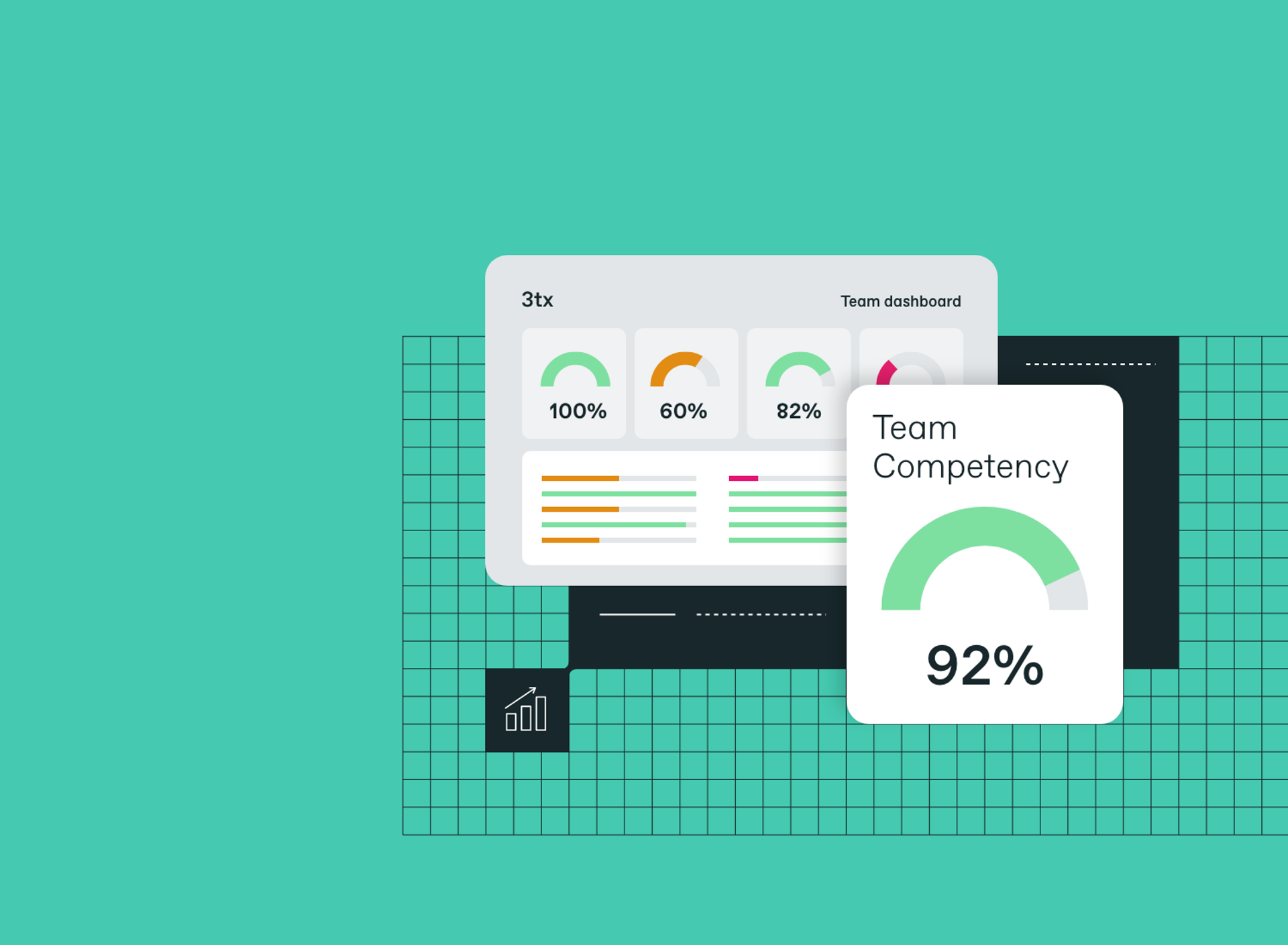
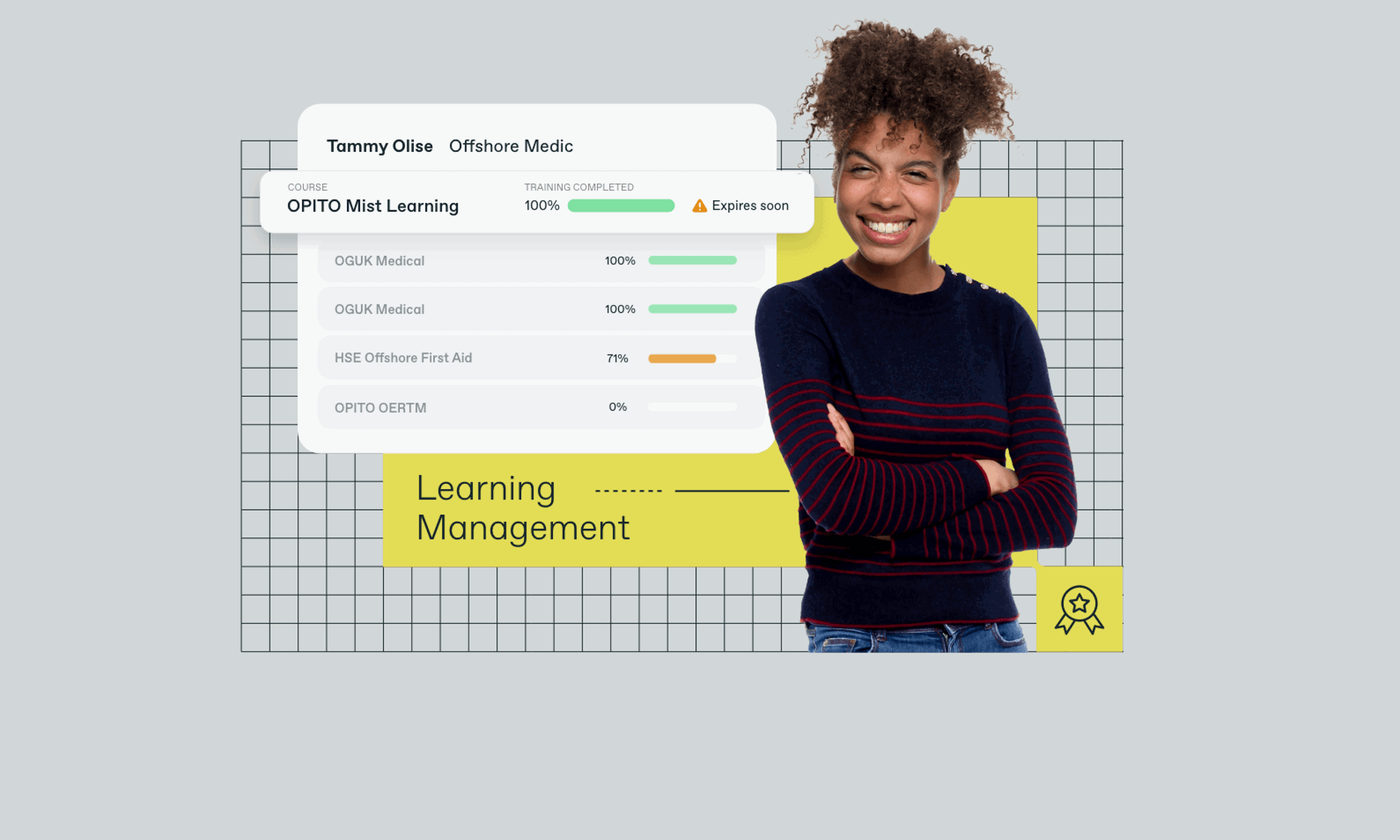
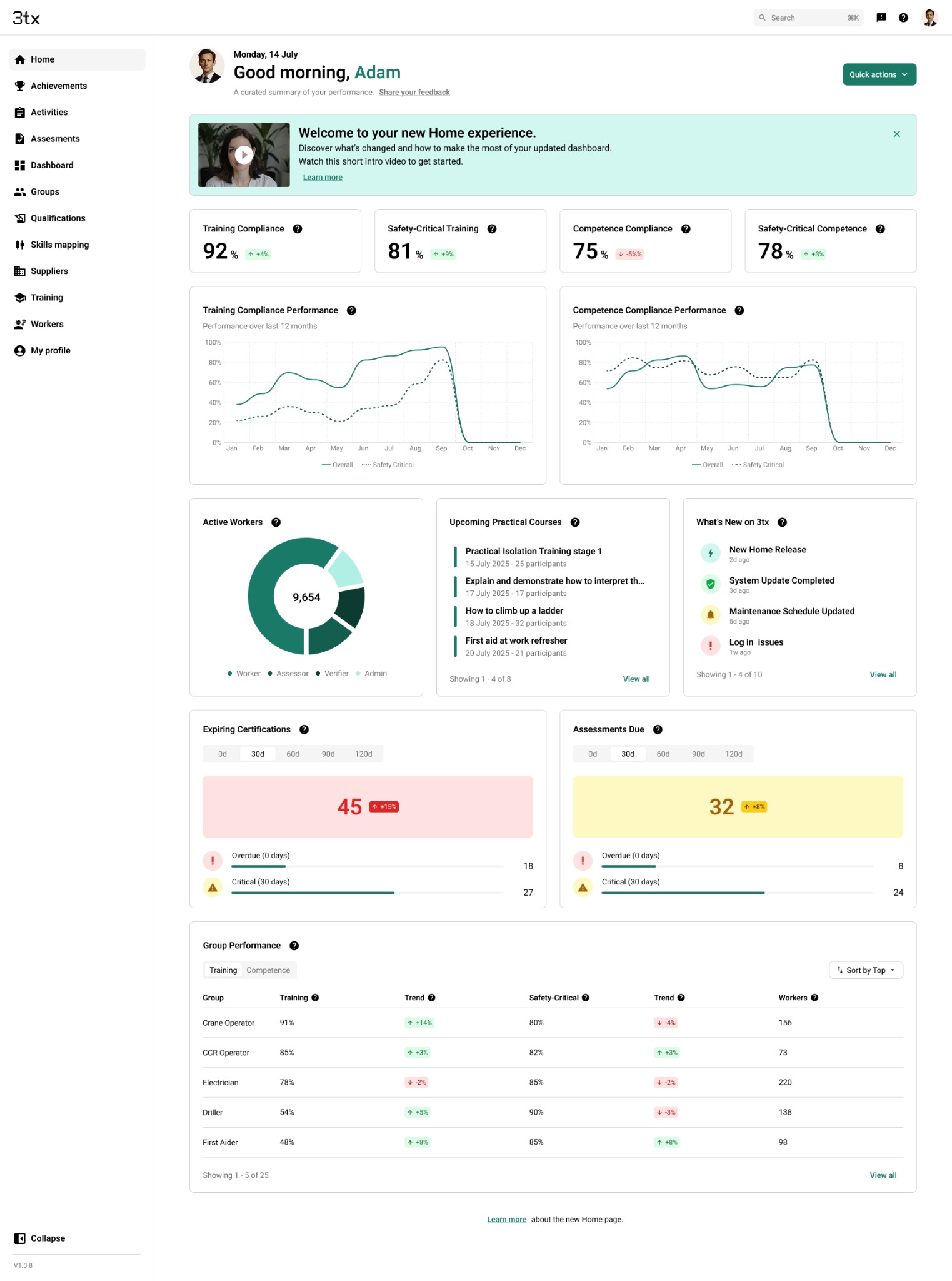
The new Home introduced a role-based operational dashboard—combining real-time insight with clear “next actions”. KPI tiles became actionable entry points rather than passive metrics, helping admins move directly from overview to execution.
- Fixed KPI tiles for key risk areas (e.g., expiring training/certifications)
- Performance trends and reporting views
- Assessment status summaries and overdue visibility
- Workforce distribution insights
- Group performance signals
Action-Oriented Flows
Instead of navigating multiple screens, core admin workflows start from Home.
Flow example 1
- Click “Expiring Trainings”
- Filter by Site / Role / Department
- Select affected workers
- Assign training
- Confirmation logged
Flow example 2
- Open “Overdue Assessments”
- Review impacted workers / assessors
- Send reminder / notify assessor
- Activity logged
Success Metrics
We defined measurable targets to validate clarity, adoption, and speed-to-task improvements.
| Metric | Target |
|---|---|
| Daily active users landing on Home | ≥ 80% per role |
| Widget interaction rate | ≥ 60% |
| Average time to task start | ≥ 30% reduction vs old flow |
| Customisation usage (if enabled) | ≥ 30% of admins |
| Reported clarity improvement | ≥ 4/5 from 80% users |
| Support ticket volume reduction | −20% within 2 months post-release |
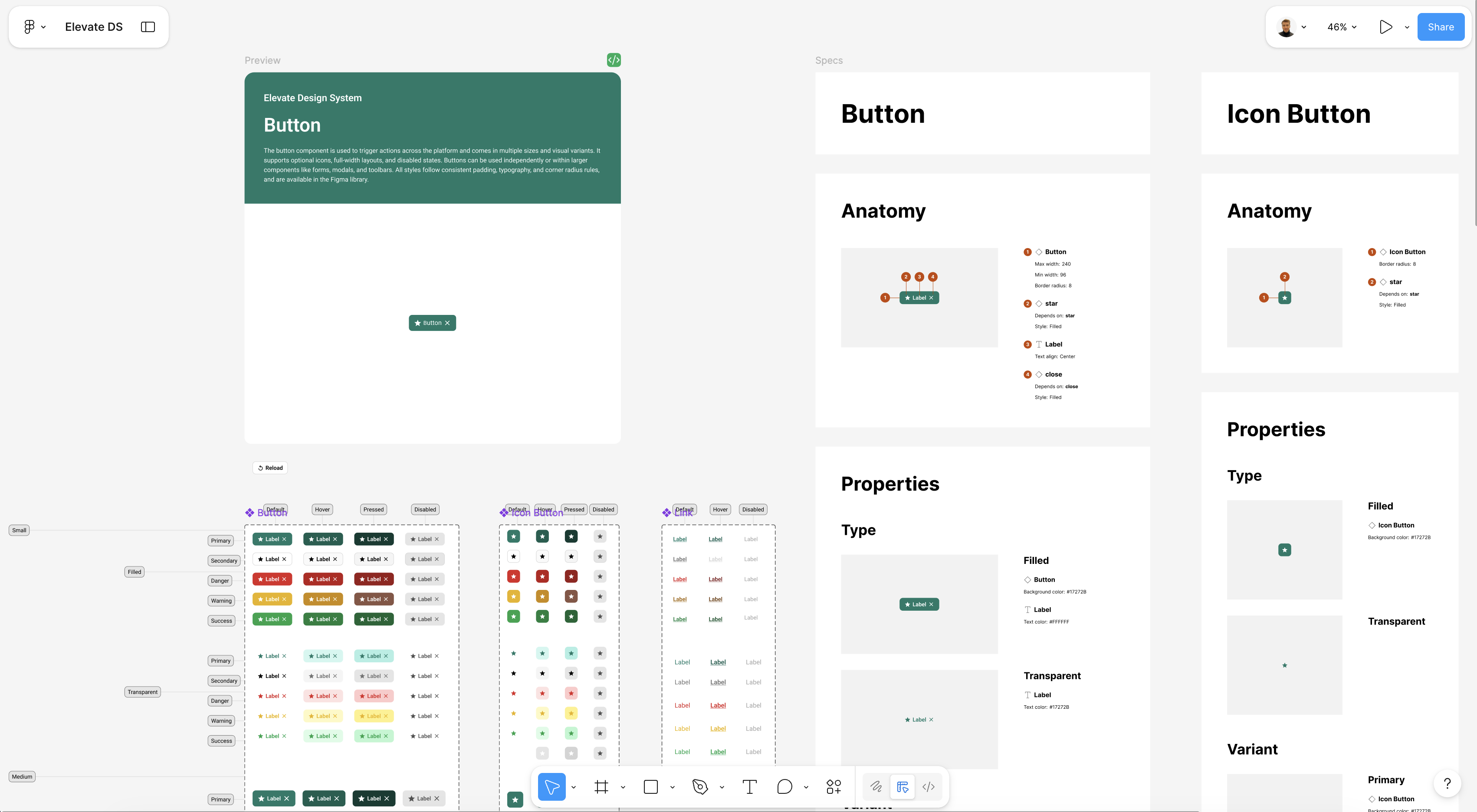
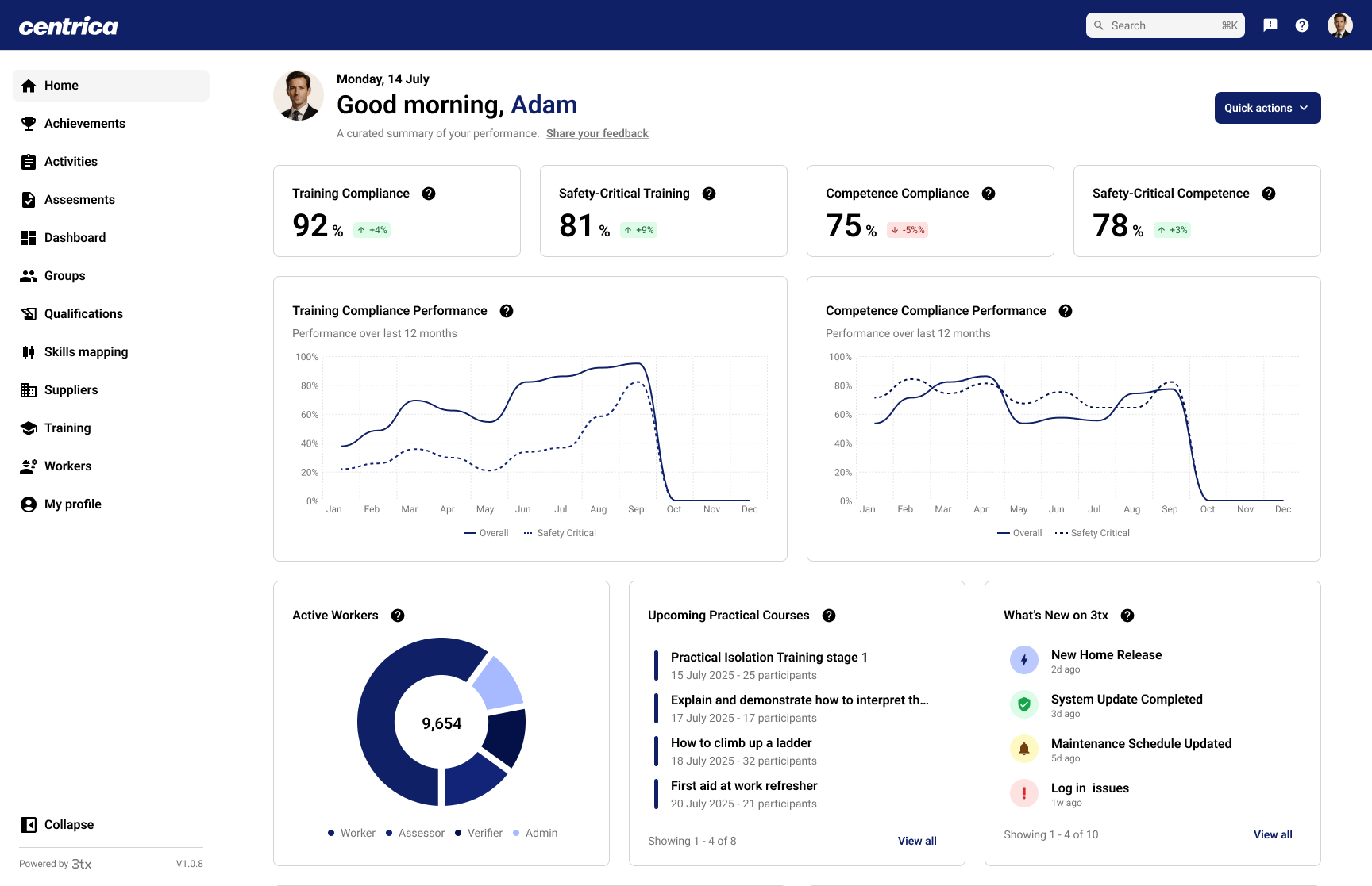
Design System — Elevate
In parallel, I established the foundations of Elevate—creating consistency across layouts, dashboards, and components so the product could scale with fewer UI regressions and faster delivery.
- Unified layout grid and spacing rules
- Standardised KPI tiles and dashboard components
- Tokenised colour foundations and accessibility baselines
- Reusable data visualisation patterns
- Components ready for dev handoff

Impact (First 3 Months)
- Delivered a new Home concept and validated workflows
- Established UX principles and platform direction
- Defined success KPIs to support rollout validation
- Built foundations of the Elevate design system for scale