Three design systems, built from zero and kept alive.
I've built three enterprise design systems from zero: Zync at Zapp,
Elevate at 3TX and YOBI at YOOBIC. Building one is the easy part.
What compounds is the work after launch: maintaining, improving and scaling it as the product,
the team and the strategy change.
Most systems die not because they were badly built, but because nobody owned them after launch.
I treat all four phases as one job — and I've done each of them more than once.
01 — BUILD
From zero
Foundations, tokens, naming conventions and the first component libraries — established where none existed.
02 — SCALE
Across surfaces
Stretching one language across consumer, ops, mobile and web without it fracturing under growth.
03 — MAINTAIN
Single source of truth
Governance, versioning, specs and QA so the system stays honest as contributors and modules multiply.
04 — IMPROVE
Through strategy shifts
Evolving the same foundations through re-platforming and new paradigms — including the AI era.
The method behind all three
Atomic Design, end to end
Every one of these systems is structured the same way — small, composable parts building up to whole
screens. It's what lets the same foundations scale across platforms and survive a change of strategy.
01
Atoms
Foundations
Text styles, colour tokens, icons, shadow, border.
02
Molecules
Components
Buttons, input fields, search box, menus.
03
Organisms
Patterns
Nav bars, rating widgets, cards, KPI tiles.
04
Templates
Skeletons
The structure of a screen, page or modal.
05
Pages
Features → App
Real screens, assembled and shipped.
The three systems
Build · Scale · Maintain — in practice
Zync
Zapp · 2025 · current
Lead Product Designer — quick-commerce, real-time logistics
Stack React · React Native
Zapp is a London-born quick-commerce service — groceries, drinks and everyday essentials delivered to your door in minutes, picked from a network of local dark stores.
My current work. Zync is the system that holds Zapp's quick-commerce ecosystem together — one
language stretched across two very different audiences: customers ordering in minutes, and operators
running stores at high velocity. The challenge here is less "build" and more "scale and maintain across
surfaces that move at different speeds."
Atomic Design
Built atomically — from colour & type tokens (atoms) up through components and
patterns to full ordering and ops screens (pages) — so consumer and operational
surfaces share the exact same primitives across iOS, Android and Web.
Zapp brand colour tokens — a single 50–950 scale, the atomic foundation every Zync component builds on.
New workflow · Design engineering
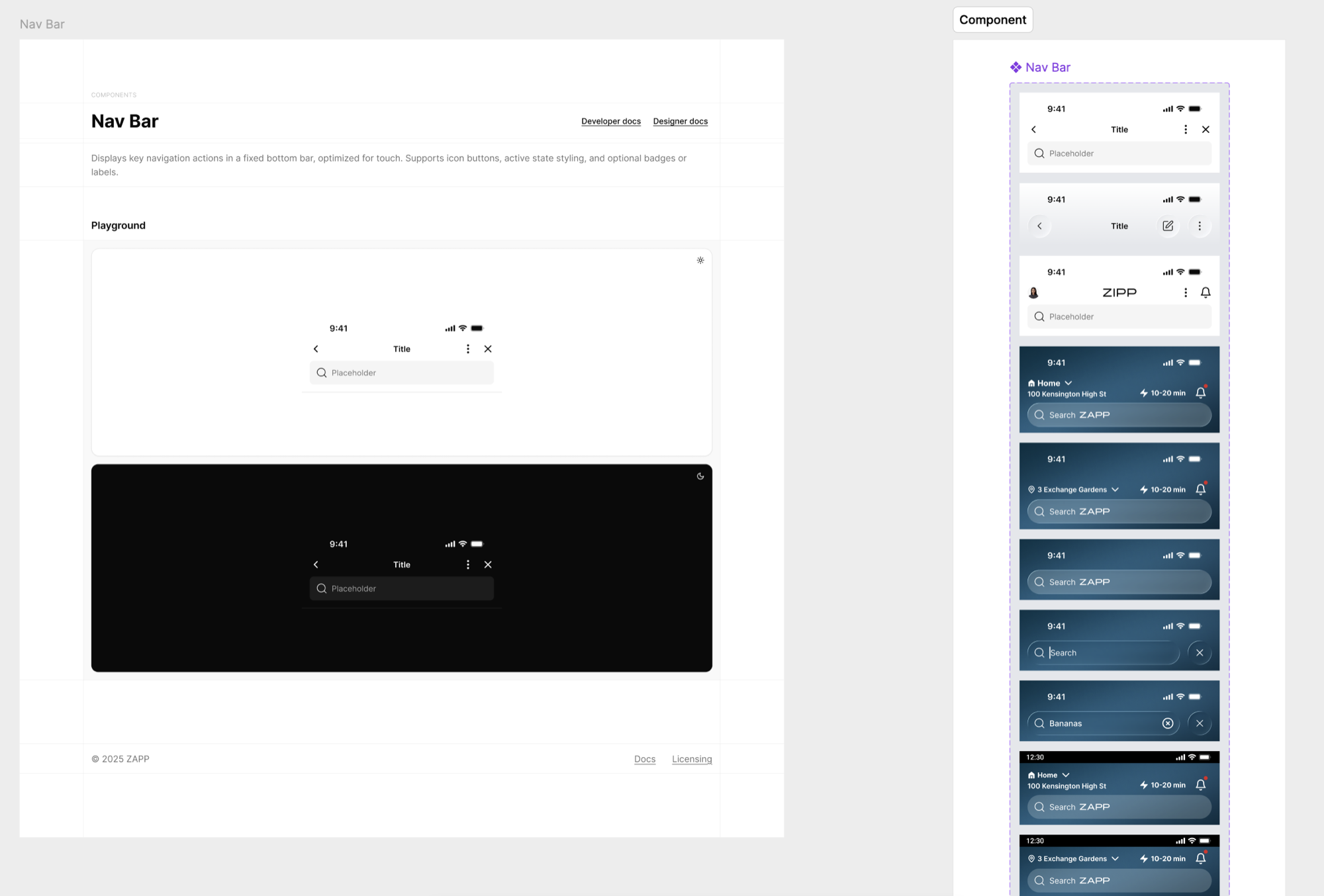
I build Zync's components in code — with Claude, inside Storybook — not only in Figma.
It collapses the gap between design and engineering: pixel-perfect execution with no developer
interpretation and nothing lost in hand-off. I assemble entire features from real,
production-grade components and demo them live from my own iPhone — showing exactly how a
feature will look and behave once it ships. No more a beautiful Figma prototype that turns out only
half-feasible; what stakeholders review is the real thing, running on a device.
Patterns for real-time, time-critical retail execution
Shared primitives across iOS, Android & Web
Maintained
One source of truth across consumer app and ops tooling
Consistency held while squads ship independently
UX strategy aligned to the broader experience principles
Improved & scaled
Scaling Zync to support high-velocity retail as the business grows
Bridging customer-facing polish with operational density
Multi-platform parity without duplicating the work three times
2audiences — consumer & ops — one system
3platforms — iOS, Android & Web
Livein market, maintained daily
Elevate
3TX · 2025
Lead Designer (contract) — B2B compliance & workforce competence
Stack React · TypeScript
3TX (by 3t) is a B2B platform for safety-critical industries — bringing workforce training, competence and compliance into one system so high-risk operations stay audit-ready.
The clearest "from scratch" story. 3TX was fragmented across modules with inconsistent UI and no
scalable system. In parallel with redesigning the Home into an operational command centre, I laid the
foundations of Elevate so the product could scale with fewer UI regressions and faster delivery.
Atomic Design
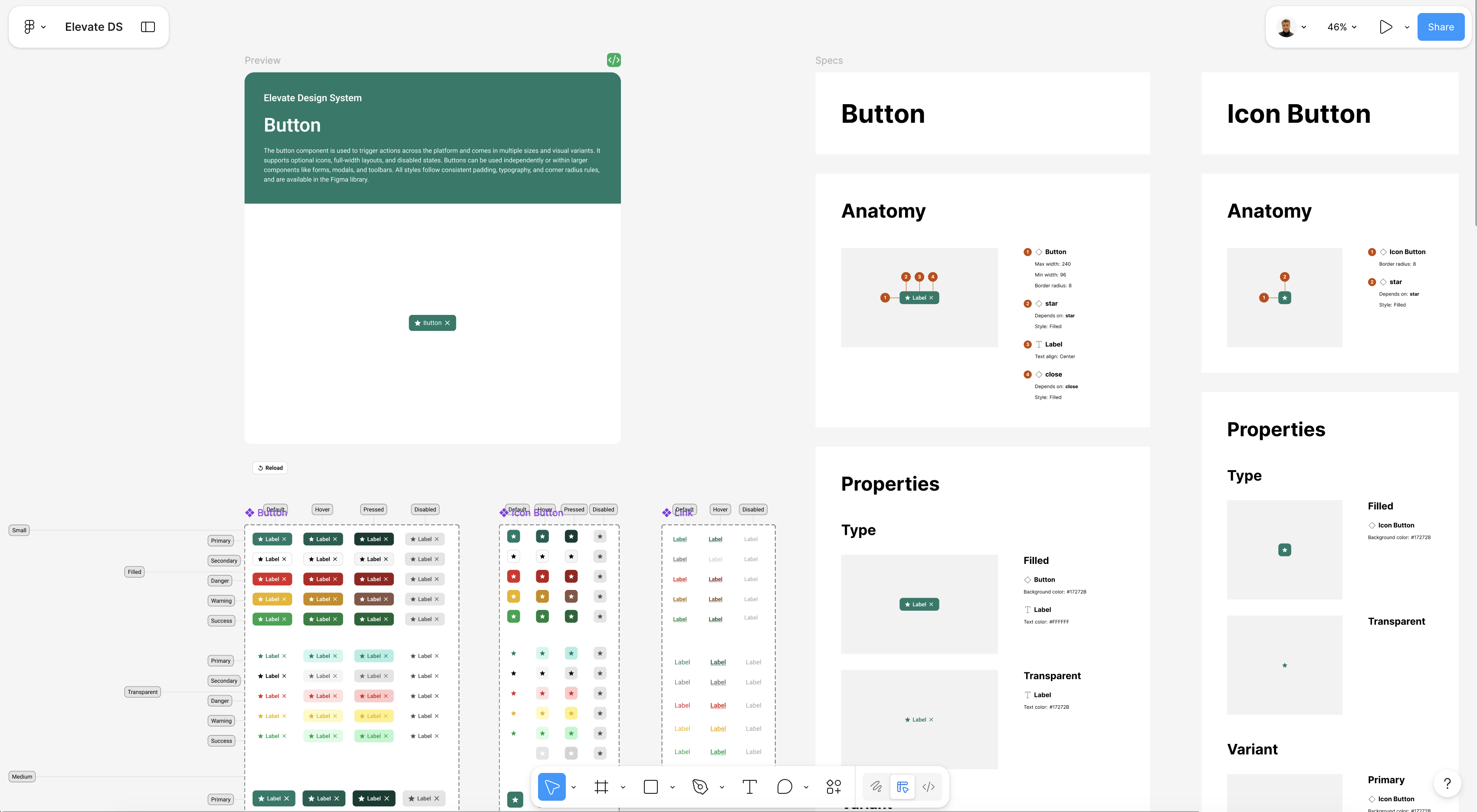
Atomic from day one — tokenised atoms → KPI tiles and dashboard organisms
→ Home templates, each component fully specced in Figma (anatomy, properties, variants
and states) for clean dev handoff.
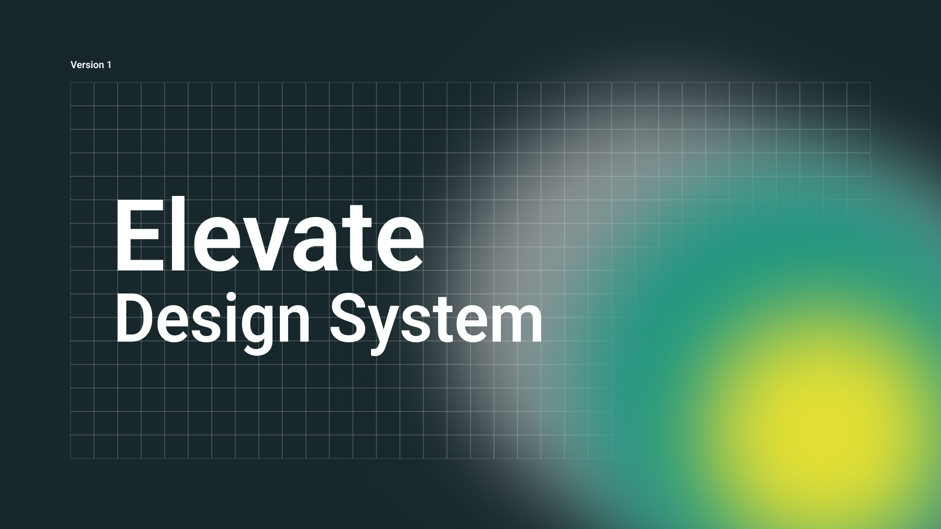
Elevate Design System — Version 13TX Home — operational command centre, built on Elevate
Figma component specs — Button anatomy, properties, size & type variants, and Default / Hover / Pressed / Disabled states
Consistency across layouts, dashboards and modules
Improved & scaled
Replaced fragmented patterns with one coherent language
Foundations designed to absorb new modules without rework
Faster delivery and fewer regressions as the product grows
−20%target support tickets, post-release
−30%target time-to-task vs old flow
1system replacing fragmented module UI
YOBI
YOOBIC · 2018–2025 · 7 years
Head of Product Design — enterprise frontline SaaS, 2M+ workers, 80+ countries
Stack Ionic · Angular
YOOBIC is a frontline employee experience platform — task execution, communication and mobile learning for 2M+ retail, hospitality and field workers across 80+ countries.
The deepest proof point. YOBI started as a Figma library and grew into 200+ governed components
across six libraries — and I owned it through three distinct strategy eras (task platform → pandemic
continuity → AI-first) on the same foundational language. That continuity, not any single screen, is the work.
Atomic Design
Atomic Design at scale — six libraries organised atoms → pages, 200+ governed
components with naming conventions and accessibility baked into the foundations, so a 30+ module
platform stayed coherent across seven years.
System map — one library, the whole platform
OperationsTasks · checklists · audits · forms · reports
YOBI — cross-platform component library200+ governed components · six libraries · one source of truth
renders natively across
Web app
iOS & Android apps
One governed component library powers 30+ modules across three pillars — identical on web and mobile.
White-label — one system, every brand
YOOBIC ships as a white-label app: every retailer runs the same components, in their own brand.
Because colour, type and shape live in semantic tokens, re-skinning an entire deployment is a token
swap — not a redesign.
Today · 6 of 10 tasks
60%
H&M themecolor.brand.primary = #CC071E
Today · 6 of 10 tasks
60%
Boots themecolor.brand.primary = #1B448E
Same component, same props, same code — only the brand token layer changes. One retailer ships red, the next ships navy, on one shared YOBI system.
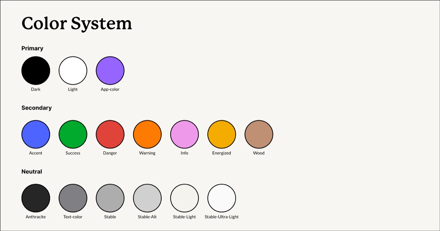
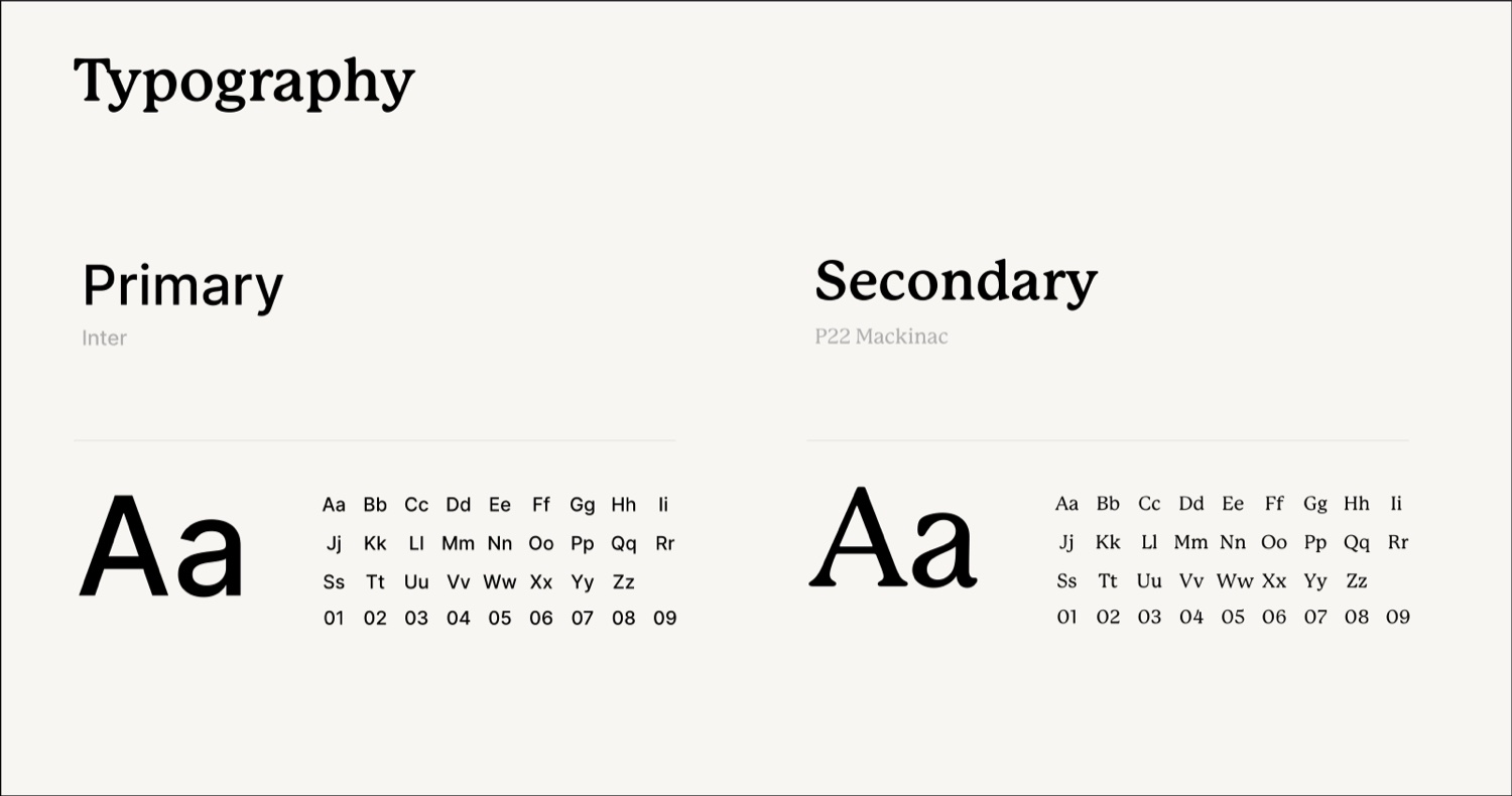
The 2024 rebrand shows the full stack of foundations I governed: a structured colour system
(Primary · Secondary · Neutral), a dual typeface pairing — Inter for product UI and
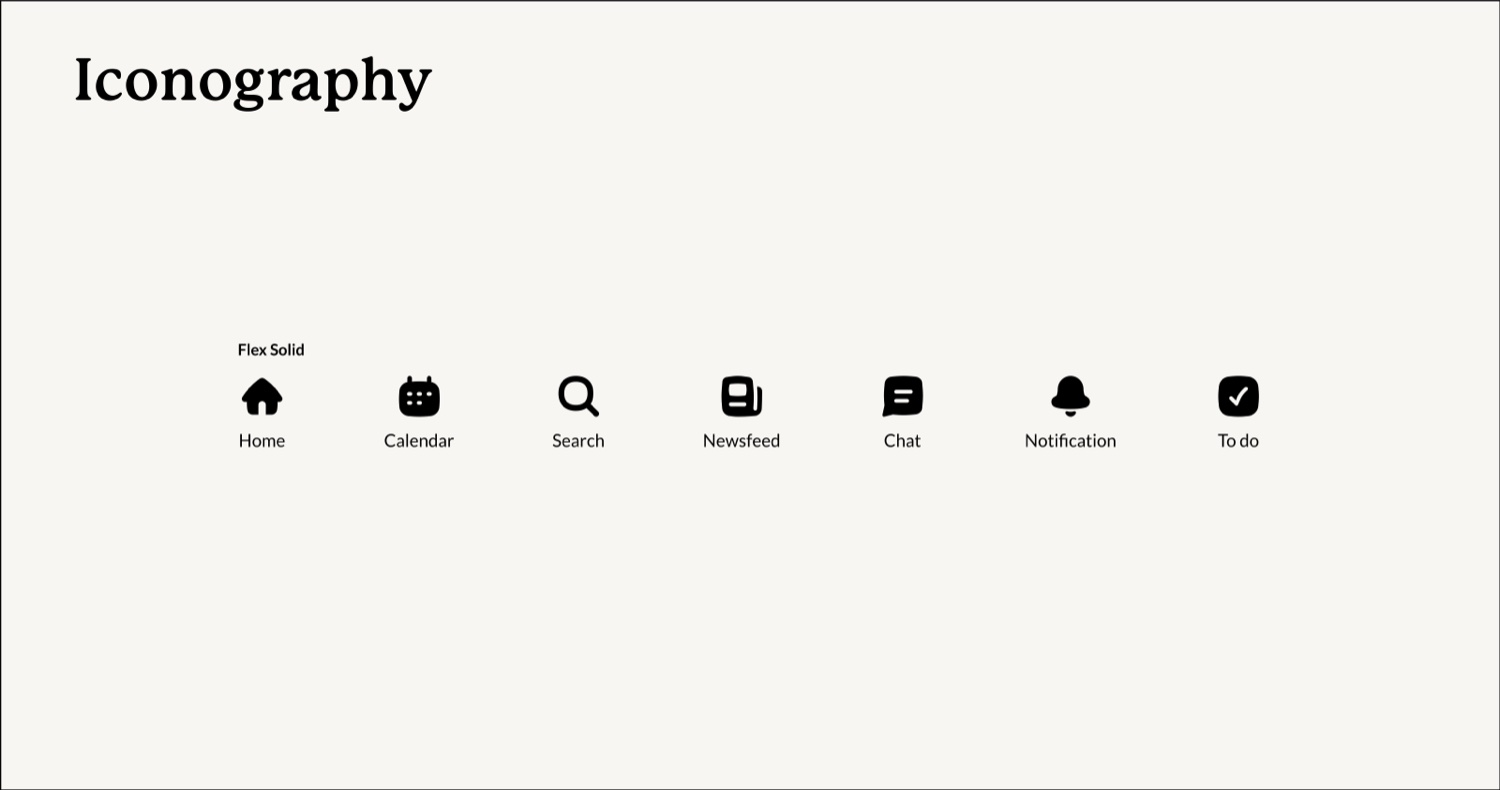
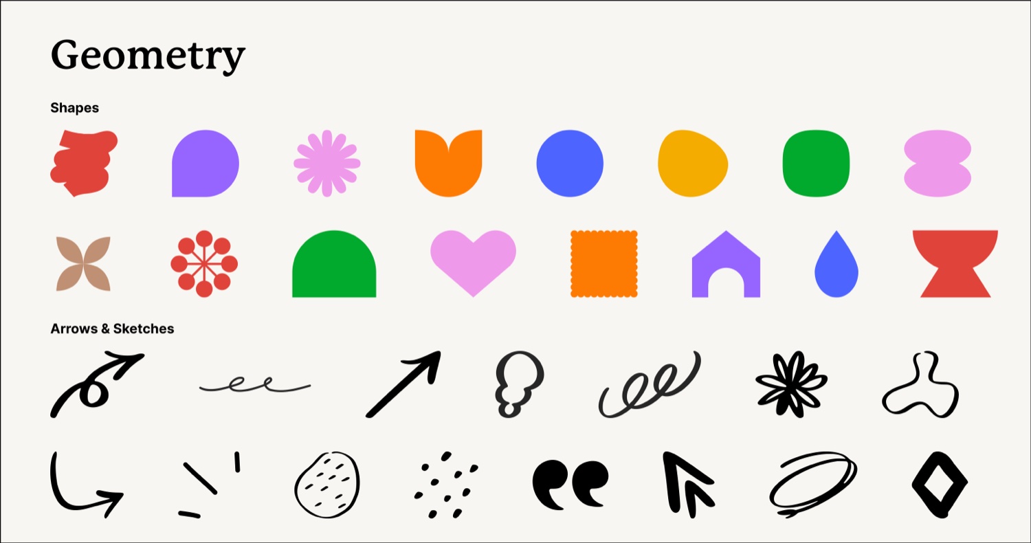
P22 Mackinac for editorial — the Flex Solid icon set, a geometric
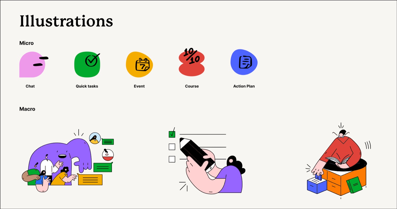
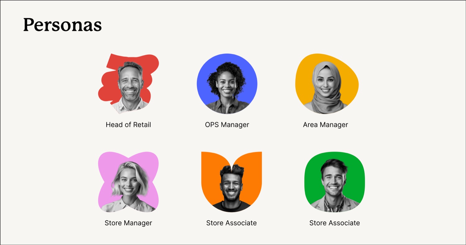
shape language, a branded illustration system (micro + macro), and research-grounded personas spanning
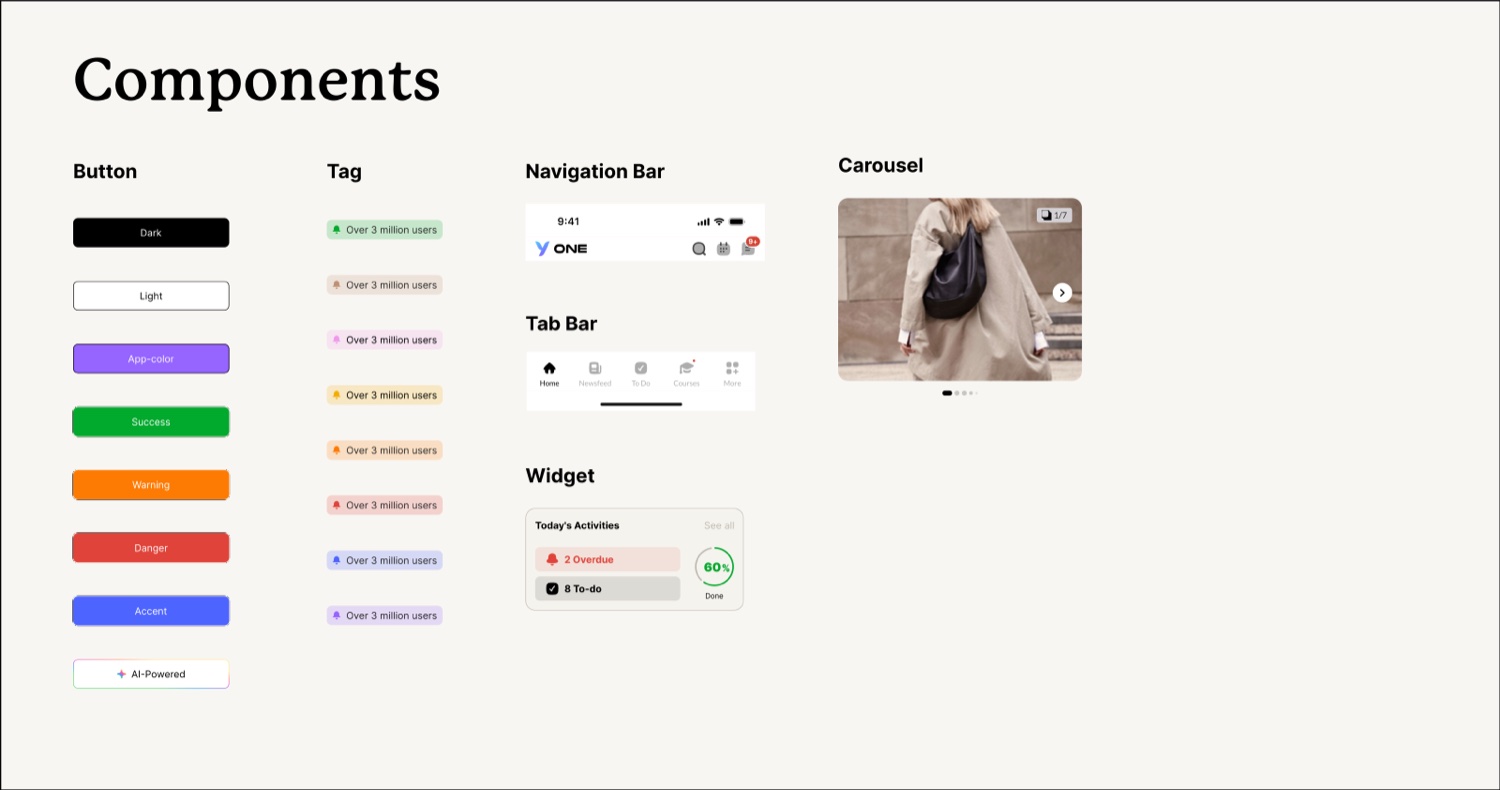
Head of Retail to Store Associate. Note the AI-Powered button — AI patterns promoted
into first-class, governed components.
Colour system — Primary · Secondary · NeutralTypography — Inter & P22 MackinacIconography — the Flex Solid setShape language — geometry & marksComponents — incl. an AI-Powered buttonIllustration system — micro & macroPersonas — frontline to head office
And here is the system doing its job — those atoms, components and patterns composed into real
frontline product surfaces:
Components in production — an information hub, daily priorities & calendar, and targeted update workflows, all assembled from YOBI components.
Built
From no system to 200+ components across six libraries
Tokens, naming conventions & accessibility standards baked in
First principled IA — one navigation logic across 30+ modules
Maintained
Made it the single source of truth, with specs and QA
Documentation & governance to keep contributors aligned
Closed the 20–30% of design lost in design–dev handoff
Improved & scaled
Compressed a multi-quarter mobile roadmap into months — without breaking the system
Extended it into the AI pivot: new patterns for the NEO assistant
Grew the design org and craft bar around the system
200+governed components, six libraries
25%shorter onboarding for new joiners
40%training engagement on the AI assistant (NEO)
Under the hood
The mechanics every component inherits
A design system is only as good as its conventions. This is the logic I bake in so hundreds of
components stay consistent, themeable, accessible and safe to change at scale — the same foundations
across Zync, Elevate and YOBI.
Primitive tokenblue-900=#002C3Cthe raw value — never used directly in a component
→
Semantic tokencolor.action.primary→blue-900intent — swap this one layer to re-theme everything
→
Component tokenbutton.bg.default→color.action.primarybinding — the only thing the component reads
Design tokens
Three tiers — primitive → semantic → component. Re-theme the whole system by swapping the semantic layer; no component ever hard-codes a hex.
--color-action-primary
Naming conventions
Predictable, namespaced names so hundreds of components stay findable — and every Figma layer maps 1:1 to code.
Button/Primary/Large/Disabled
Component API · props
A small, typed surface — variant, size, state, slots. The Figma variant set and the code props are the same contract.
<ButtonvariantsizestateiconfullWidth/>
States & variants
Every interactive component ships the full set up-front, so nothing has to be improvised downstream.
default·hover·focus·pressed·disabled·loading
Documentation
Usage do's & don'ts, prop tables, accessibility notes and changelogs — so a new joiner ships without asking.
When to use·When not to· Props · A11y
Governance & versioning
Semver, a contribution model, deprecation paths and QA gates keep one source of truth honest as it scales.
v2.4.0·deprecate→migrate→remove
Accessibility
Never bolted on at the end — WCAG 2.1 AA lives at the token level (contrast-safe pairs), with focus order, ARIA roles, keyboard paths and 44px touch targets built into every component.
AI in design work
AI as an accelerant — never the author
AI multiplies judgement; it can't replace it. The understanding has to come first — then the
tools make it faster. Used the other way round, you just ship plausible nonsense at scale.
Research & synthesis
Clustering interviews, support tickets and usability notes into themes — so I spend my time on the call to make, not the transcript.
I still read the raw data
Pattern & variant exploration
Generating breadth quickly — states, edge cases, copy variants — then curating down with a human eye for hierarchy and intent.
I own the final call
Design-to-code handoff
Working knowledge of AI design-code tools to tighten the loop between Figma components and what engineering actually ships.
Specs & QA still gate it
Documentation & governance
Drafting component docs, usage guidelines and changelogs so the system stays legible — reviewed, never auto-published.
Accuracy is non-negotiable
At YOOBIC I led the exec-level conversation on where the AI assistant should suggest,
decide, or stay silent — and embedded it inside the experience rather than decorating
the UI with it. Knowing when not to use AI is the same skill as knowing when to.
Tools I use
Want to see the systems in detail?
Component libraries, documentation and screens are in the case studies, and more is available on request.
 Figma
 Claude
 Storybook
 GitHub
 Expo · iPhone