Story-led case study · Strategy · Leadership · Outcomes
Seven years building
the platform
two million frontline workers use every day.
YOOBIC · Head of Product Design · 2018 — 2025
Not just the screens — the strategy, the org and the craft bar behind them.
I turned a fragmented 30-module platform into an AI-first frontline experience, and held every
decision to a number: adoption, speed and engagement all moved.
This page tells the story first. The visuals below are a representative glimpse —
out of respect for YOOBIC's competitive confidentiality, deeper screens, performance
metrics and unreleased work remain available only on request.
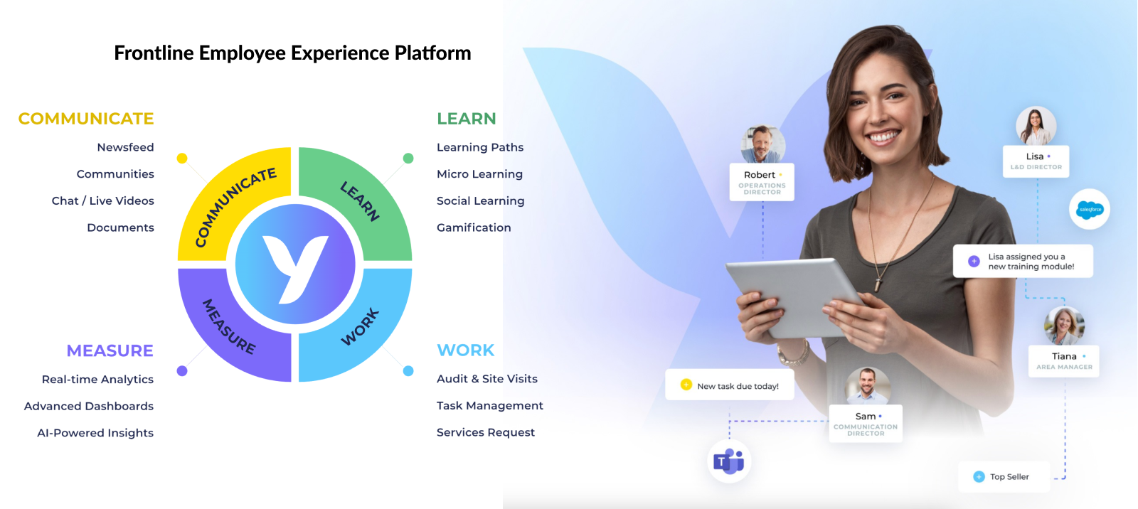
One platform, three jobs to be done — Communicate · Learn · Work — measured end to
end, for every role on the frontline, from store associate to Operations Director.
7
years tenure
30+
modules across Web & mobile
2M+
users across 80+ countries
350+
global brands
200+
design system components (YOBI)
3
product pillars: Work · Communicate · Learn
What the design decisions actually moved
35%
faster task completion, via redesigned workflows
40%
training engagement with AI-powered learning (NEO)
25%
shorter onboarding through the UX overhaul
20–30%
design–dev gap closed via specs, handoff & QA
Behind every metric: retail, pharma, logistics and grocery teams across 80+ countries.
Why this story matters
Most portfolio case studies are screenshots stitched together with retroactive narrative.
This one isn't. Over seven years I led design at the same company through three distinct
strategy eras — IPO-track growth, pandemic-era frontline criticality, and an AI
re-platforming — and in each one the job was the same: read where the business needed
to go, then set the design direction to get it there.
That meant working hypothesis-first — using research, analytics and customer insight to
decide what to build, not just how it looked — and being accountable for the
result: faster task completion, higher training engagement, shorter onboarding. The screens
changed three times. The discipline of tying every design decision to a measurable business
outcome didn't.
Three bets, and what they returned
Each started as a hypothesis, was validated with research and analytics, and was held
accountable to a number. Strategy first — the system and the screens followed.
The problem · a fragmented 30-module platform
Reset the information architecture around the user's task, not the org chart
The hypothesis: people weren't slow because the product lacked features — they were
slow because nothing shared a mental model. We unified navigation and redesigned the
core workflows across modules, then validated against task-time analytics.
35%faster task completion
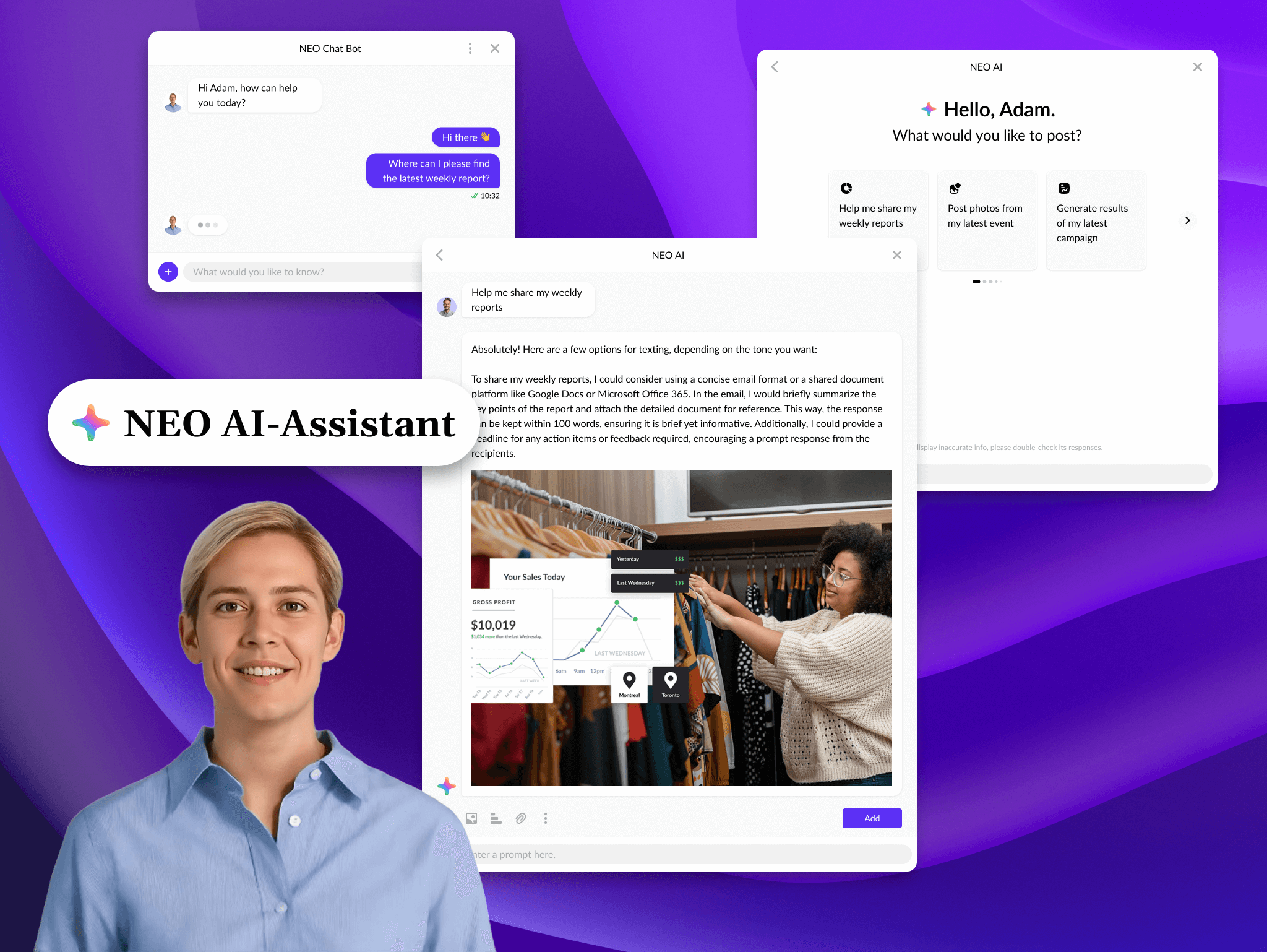
The bet · from task platform to AI-assisted experience
Lead design through the AI re-platforming instead of bolting AI on
I drove the exec-level conversation on where the assistant (NEO) should suggest, decide
or stay silent — and embedded it inside learning rather than beside it, so it
changed behaviour instead of decorating the UI.
40%training engagement (NEO)
The leverage · 20–30% of design lost in handoff
Make the design system the single source of truth, with specs and QA
YOBI went from a Figma library to 200+ governed components with documentation, tokens
and accessibility baked in — turning design–dev friction into shared velocity and
cutting the time it took new joiners to ship.
25%shorter onboarding · gap closed
The arc, in five chapters
012018
A 30-module platform with no map
I joined YOOBIC as the platform was already feature-rich: thirty-plus modules
spanning task execution, communication and learning. Functionally rich, structurally
fractured. There was no real navigation system. No design system. No design org
in the modern sense. The first job wasn't to redesign anything — it was to
understand why a product this useful felt this hard.
022019 — 2020
Foundations: YOBI, hiring, the IA reset
Three workstreams in parallel. YOBI, the design system, started
as a Figma library and grew into 200+ components across six libraries with
documentation, naming conventions and accessibility standards baked in.
The team went from a small design function to a structured org
with clear seniority ladders, rituals and a shared craft bar.
Information architecture got its first principled rewrite —
a unified navigation logic across modules so a store associate and a regional
manager weren't fighting two different mental models.
032020 — 2022
Pandemic: frontline becomes the product
When stores closed and reopened weekly, frontline workflow went from a
business-improvement product to a business-continuity product. The mobile
experience had to absorb that pressure overnight: faster task surfaces, clearer
communication primitives, learning content that worked offline. We compressed
a multi-quarter mobile roadmap into months without breaking the design system
or the team. That period set the bar for how the org operates under pressure.
042023 — 2024
The AI pivot
The product strategy moved from "task platform with reporting" to
"AI-assisted frontline experience". That's not a feature — that's a
re-platforming. Design had to lead a different conversation: what does an
assistant feel like inside a checklist? When does AI suggest, when does it
decide, when does it stay silent? How do you keep the design system honest
when half the new patterns don't have an established language yet?
The answer wasn't a single launch — it was a year of pattern-building, careful
ethics work, and teaching the org to design around the model rather
than on top of it.
052025 — now
Mature platform, new horizons
Today, the design organisation runs on a system, a craft bar, and a culture
of taste that didn't exist when I joined. The product has shipped through three
distinct strategy eras with the same foundational language. That continuity —
not any single screen — is the work I'd point a hiring manager at.
The headline artefact of the AI era: NEO, an assistant designed to sit inside the workflow — not on top of it.
What "Head of Product Design" actually meant here
Less "ran the design team", more setting direction and influencing the organisation — the part
of the role that lives beyond programme delivery and systems work.
Org & people
Hired, levelled and grew the design function from a small team to a structured org
Set the rituals: critique cadence, design reviews, quarterly portfolio planning
Owned career frameworks, performance and craft-bar calibration
System & craft
Built YOBI from zero to 200+ components, six libraries, accessibility-first
Closed the historical 20–30% design–dev gap through specs, handoff and QA
Led the IA reset that unified navigation across the three product pillars
Strategy & influence
Shaped roadmap direction and product bets with Product, Engineering and CS — not just the design of them
Set and defended the design direction through the AI re-platforming at exec level
Drove cross-functional alignment, and represented design in exec planning, escalations and pre-sales
Methodology
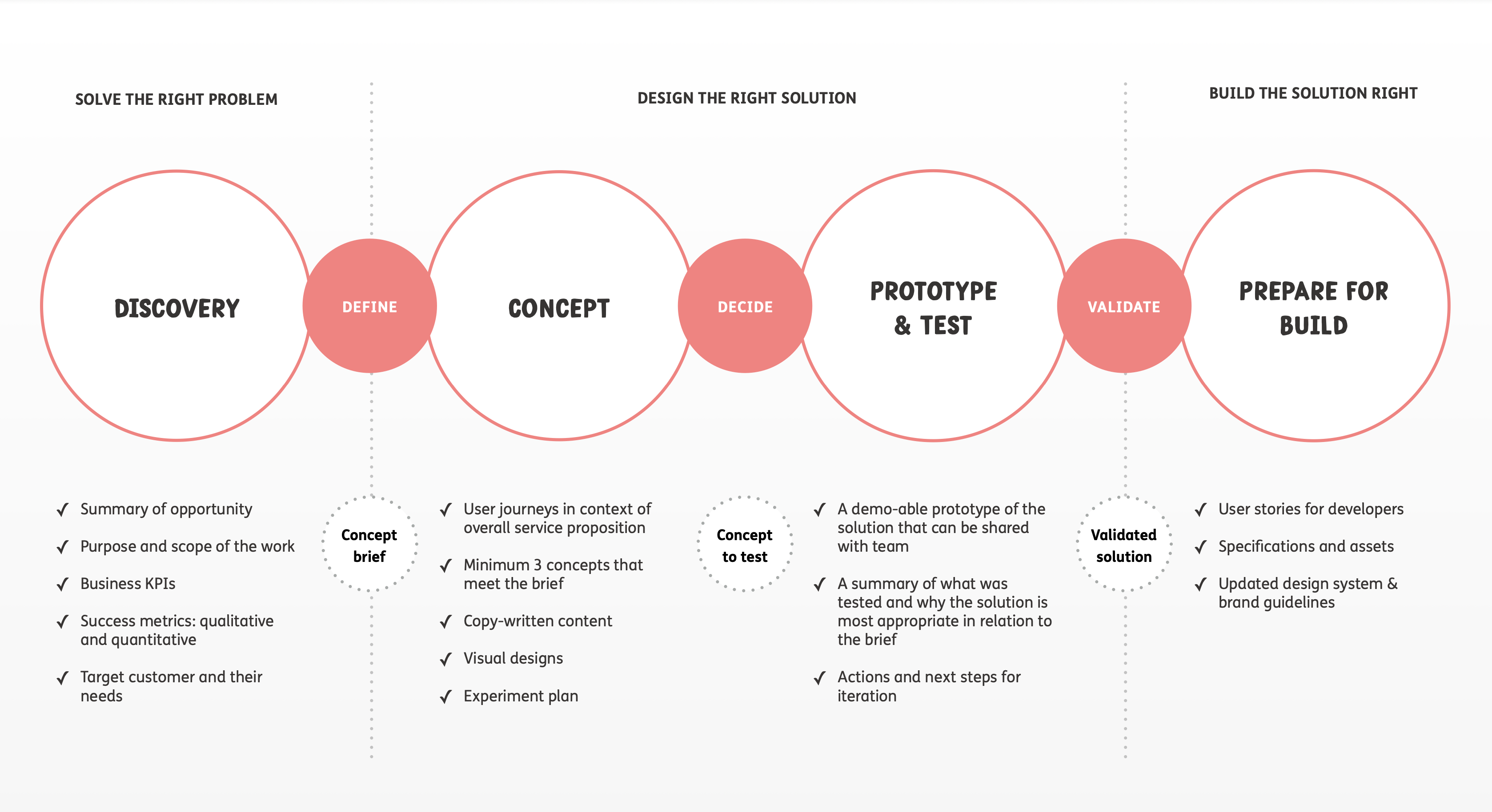
Design strategy & process
Every solution was grounded in user research and validated before it shipped — a structured, iterative loop with clear objectives at each phase, not a linear handoff.
1Research & Discovery
→
2Define
→
3Ideation
→
4Design
→
5Validation
→
6Implementation
The process ran as a loop, not a line — validation findings fed back into define and ideation rather than stopping at launch. Each phase had an explicit objective and exit criterion.
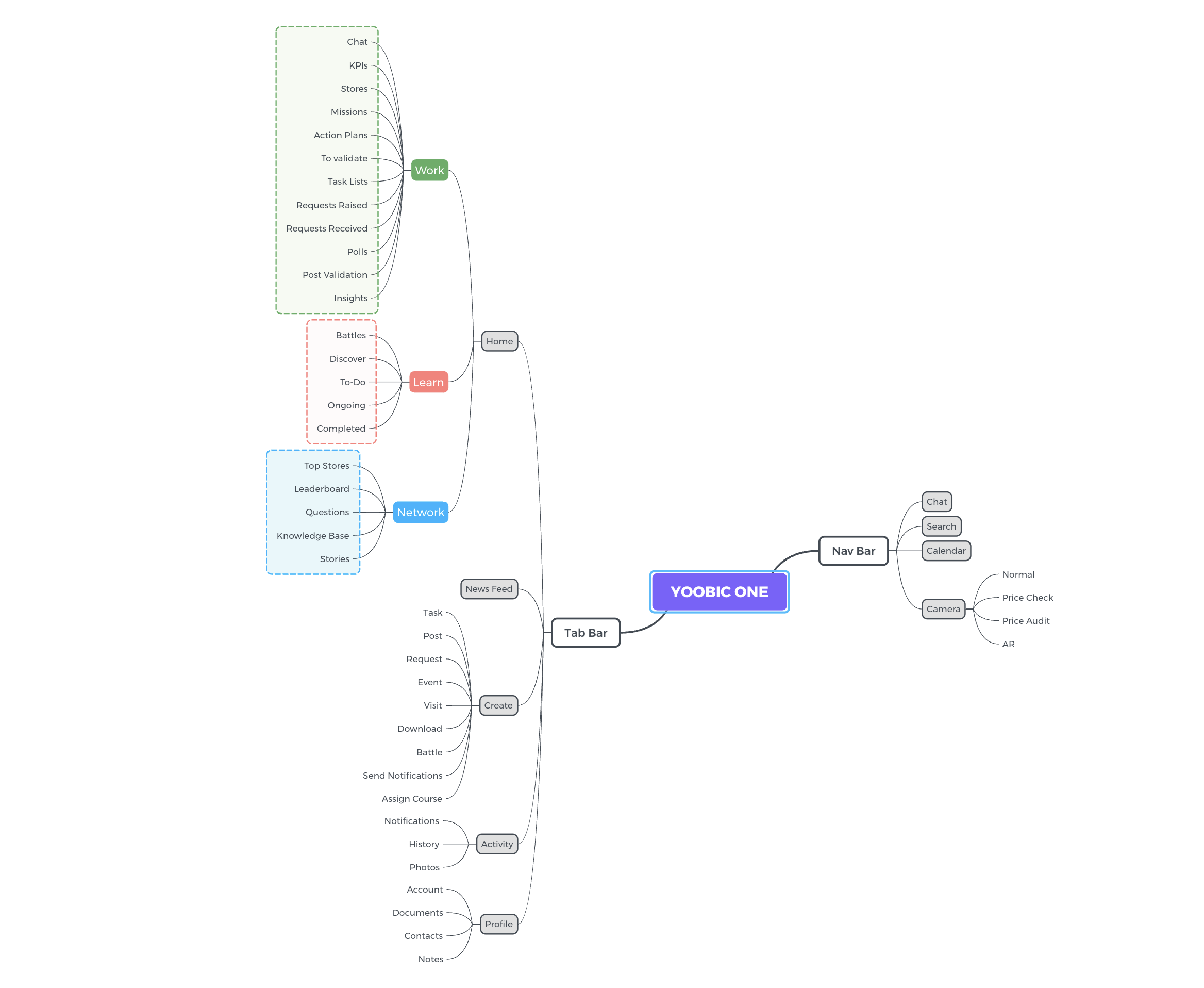
Mind Mapping & Workflow Mapping
Mapped the entire YOOBIC ecosystem — how Work, Communication, and Learn modules connected across industries and roles.
This surfaced navigation bottlenecks and redundant flows before a single wireframe was drawn, and made the IA problem legible to product and engineering at the same time.
Full ecosystem map of YOOBIC ONE — all 30+ modules, their nav paths, and the cross-pillar gaps that made the platform feel broken despite being feature-complete.
Low-Fidelity Wireframes
Quick sketches and wireframes explored multiple navigation layouts and Newsfeed configurations before committing to a visual direction.
Fast to discard, fast to test, fast to align across product and engineering — no pixel investment before the structure was validated.
ExploreNavigation & dashboard layout
ValidateDesign system architecture
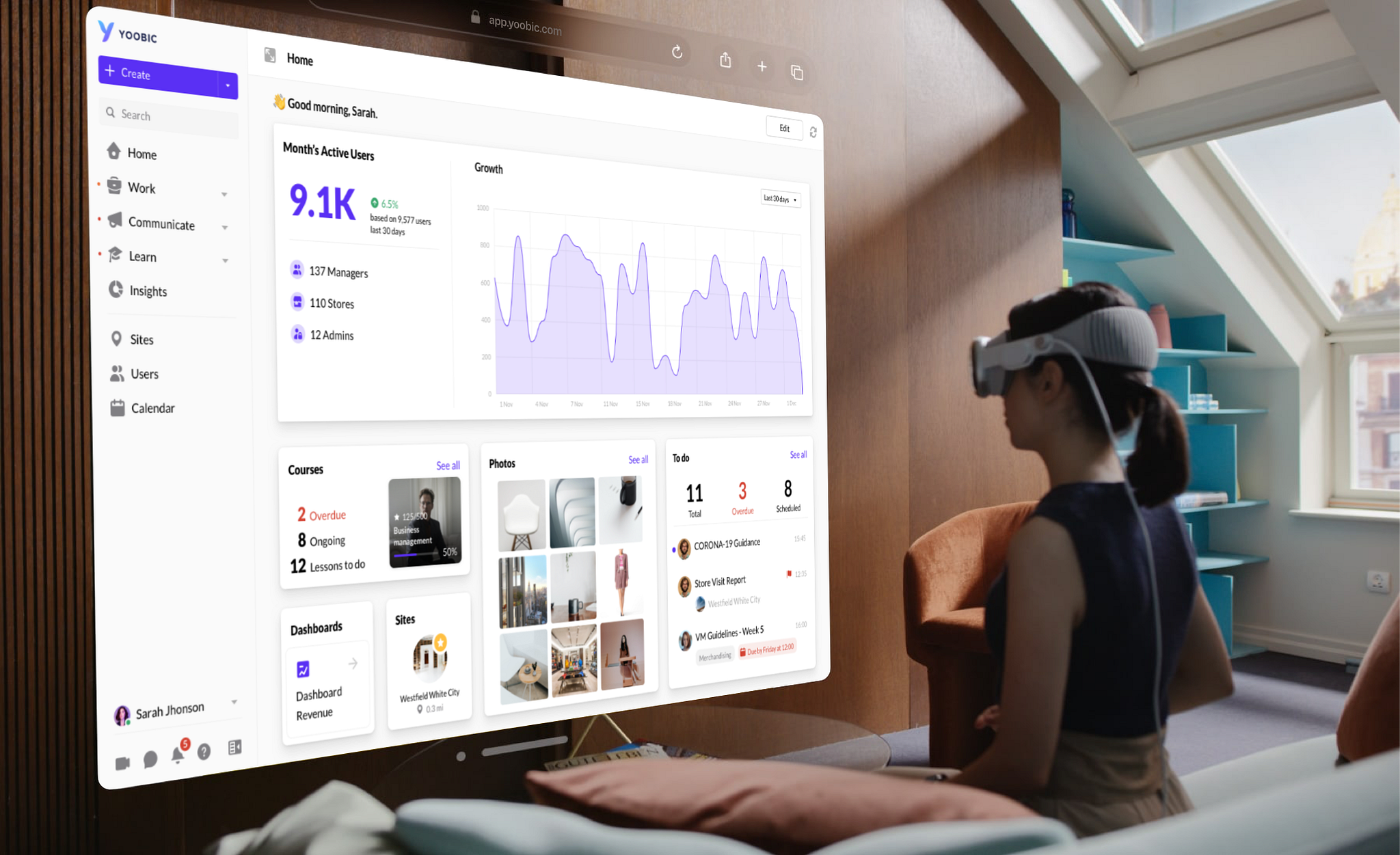
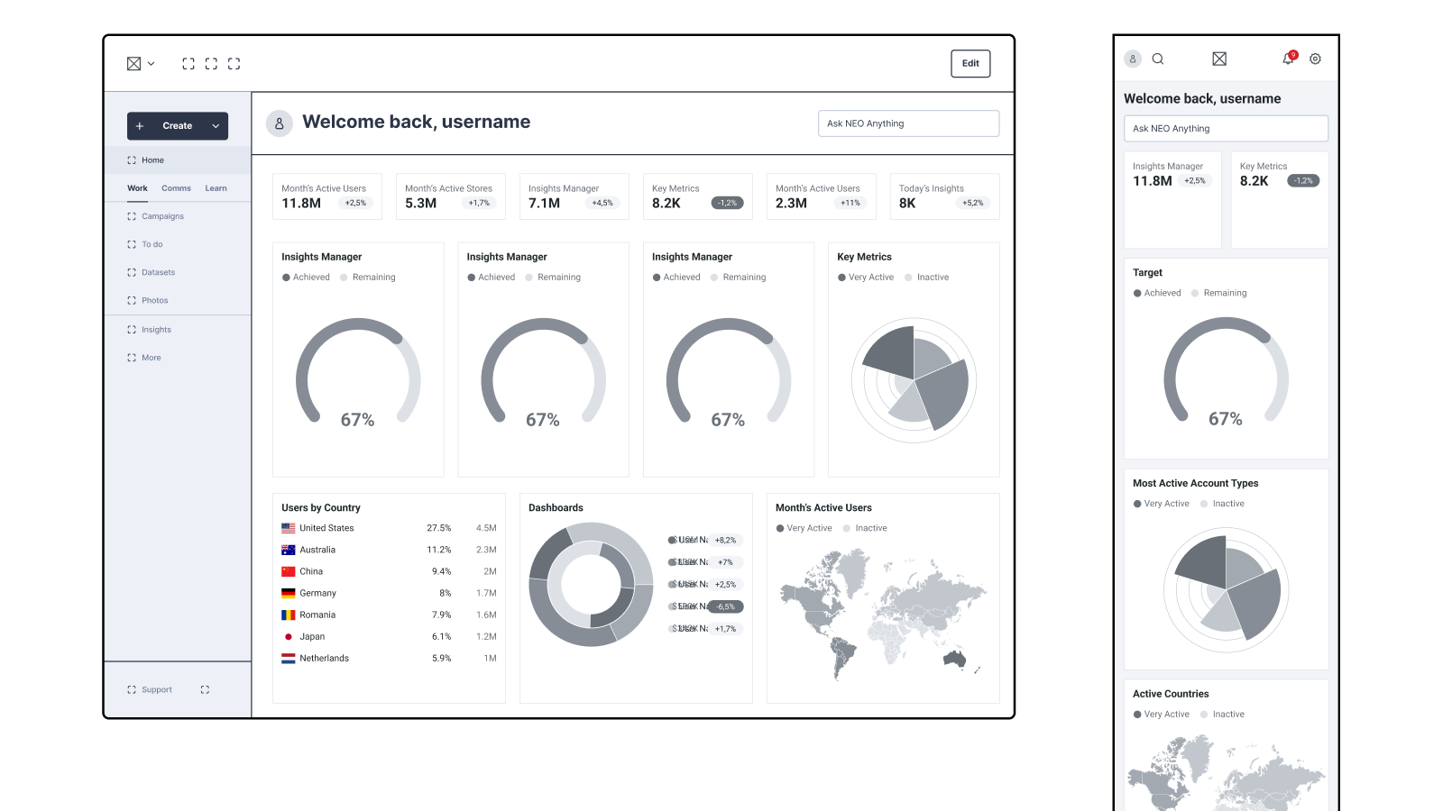
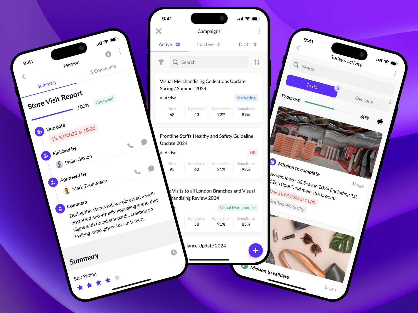
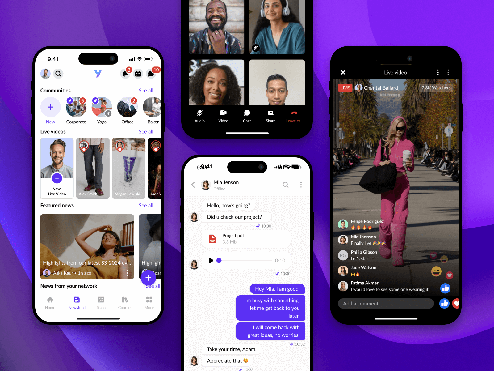
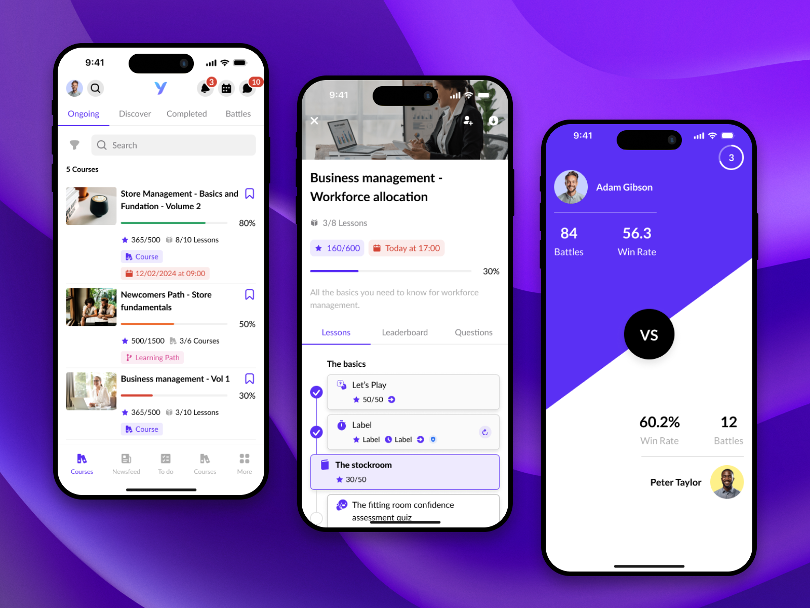
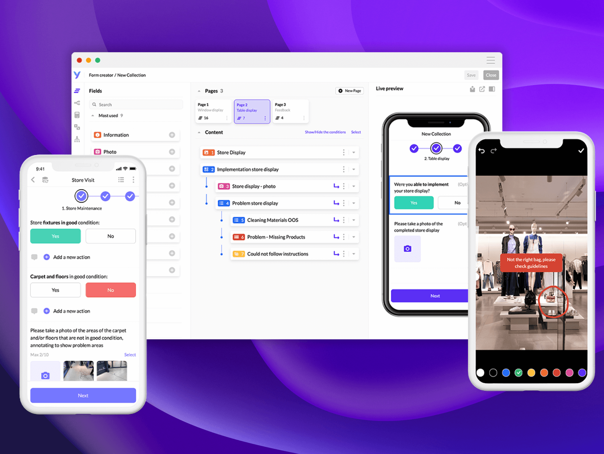
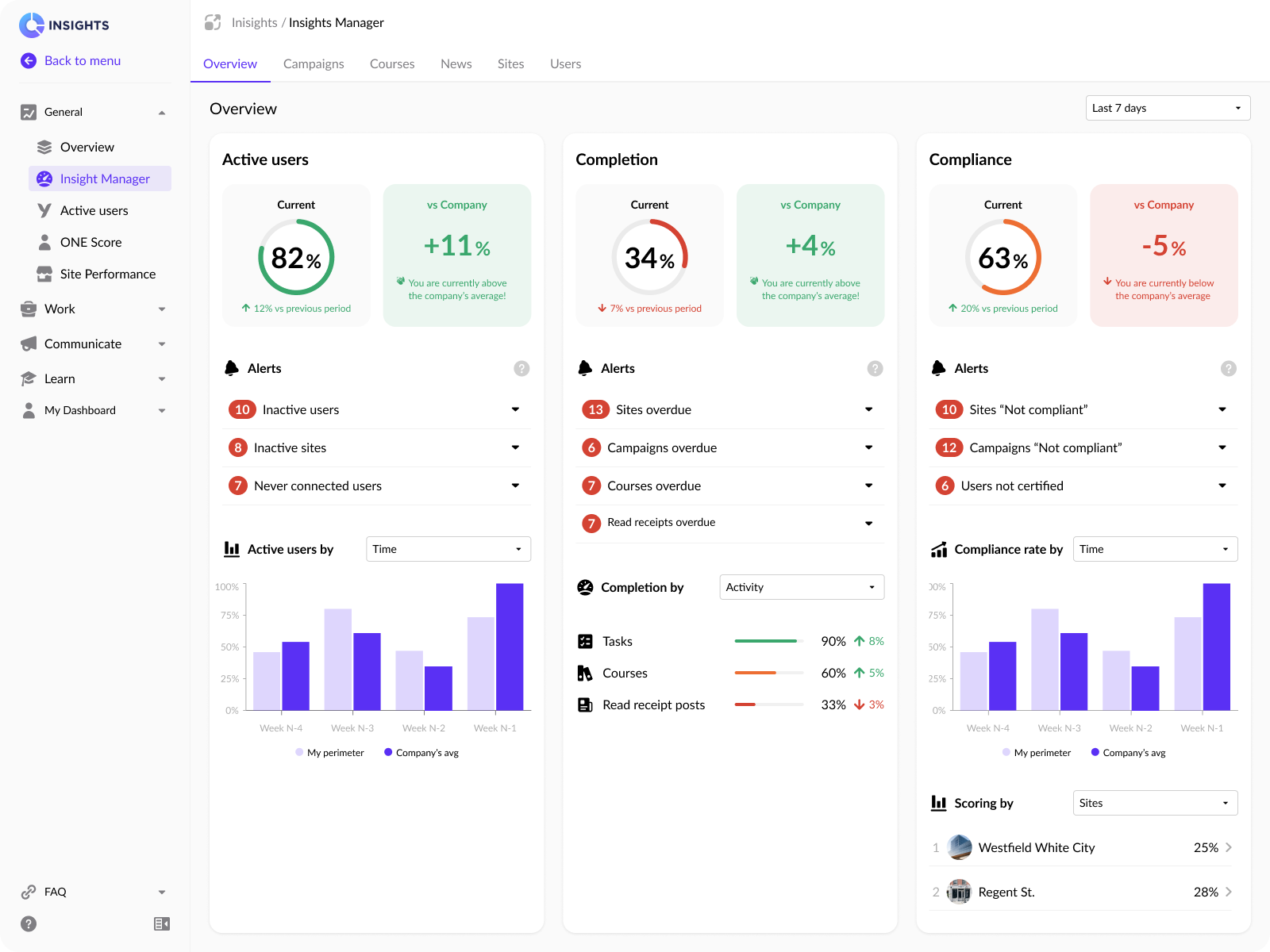
A glimpse of the surface
The story is the point — but here is what the three pillars actually feel like in the hand,
and the tools the team built behind them. Representative screens, shared with permission.
WorkTasks, store visits & campaigns
CommunicateFeed, communities & live video
LearnCourses, paths & battles
System & craft: the no-code form builder — where the design system turns into something non-designers can ship.
Measure: the same data spine — active users, completion, compliance — that kept the frontline accountable.
What seven years taught me
Continuity is the leverage you don't see in a portfolio.
The compounding effect of the same person holding the system, the bar and the
hiring philosophy across multiple strategy cycles is enormous — and almost invisible
from the outside.
A design system is a hiring tool.
The best engineers and designers I attracted came because the foundations let them
ship something they could be proud of in the first quarter.
"Frontline" means under-served by every default.
Designing for warehouse staff, retail associates and field engineers forces a
discipline most consumer teams never develop: assume bad connectivity, assume
interruption, assume someone else's KPI is on the line.
AI design is mostly editorial work.
The hardest part of the AI pivot wasn't the prompts or the patterns — it was
deciding what the product should not say.
The right time to leave a role is when the next person inherits a system,
not a rescue.
Voices from the team
Verbatim LinkedIn recommendations from people I worked with at YOOBIC.
See all on LinkedIn →
“For seven years, Arcangelo stayed focused, resilient under pressure, and
showed strong commitment to every key project. […] You never refused any of our
many requests, no matter how tight the deadlines were.”
Baptiste HornSenior Product Manager · YOOBIC
“I worked with Arcangelo for 5 years at YOOBIC, where we collaborated on
building the company's design system from the ground up. […] Arcangelo
consistently focused on design consistency and contributed to key conversations
around accessibility, tokens, and visual standards.”
Damien ArondelDesign System Lead · Senior Frontend Engineer
“I had the pleasure of working with Arcangelo at YOOBIC on our dashboard
and AI agent projects, and I can confidently say he's a standout design leader.
His creative vision and knack for turning complex ideas into clear, engaging
designs made all the difference.”
Benjamin FranckSenior Product Manager, Boomi · ex-YOOBIC
Some of the brands on the platform
A few of the 350+ global brands whose frontline teams run on YOOBIC.
Want to see the actual work?
Screens, design system internals and product metrics are available on request, under a
light NDA.