

I lead product design across Zapp's ecosystem: the consumer app, the web app, the operational tools behind them, the Zync design system, and the AI-assisted workflow we build with. I own each piece end to end, from the problem to the shipped screen. Zapp+, the membership, is where this page goes deepest — from the paywall to the retained member.
01 — Context
A complex product, moving fast.
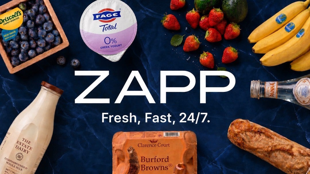
Zapp is a high-velocity quick-commerce product spanning customer experiences, operational tools and a growing ecosystem of product surfaces.
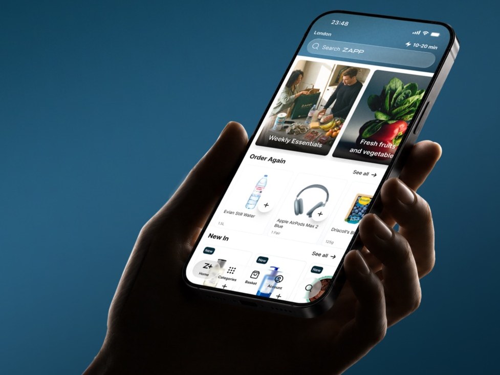
Consumer app
Browsing, ordering and tracking: the surface most customers judge Zapp by.
Zync design system
The shared language underneath: governed components, variants and states.
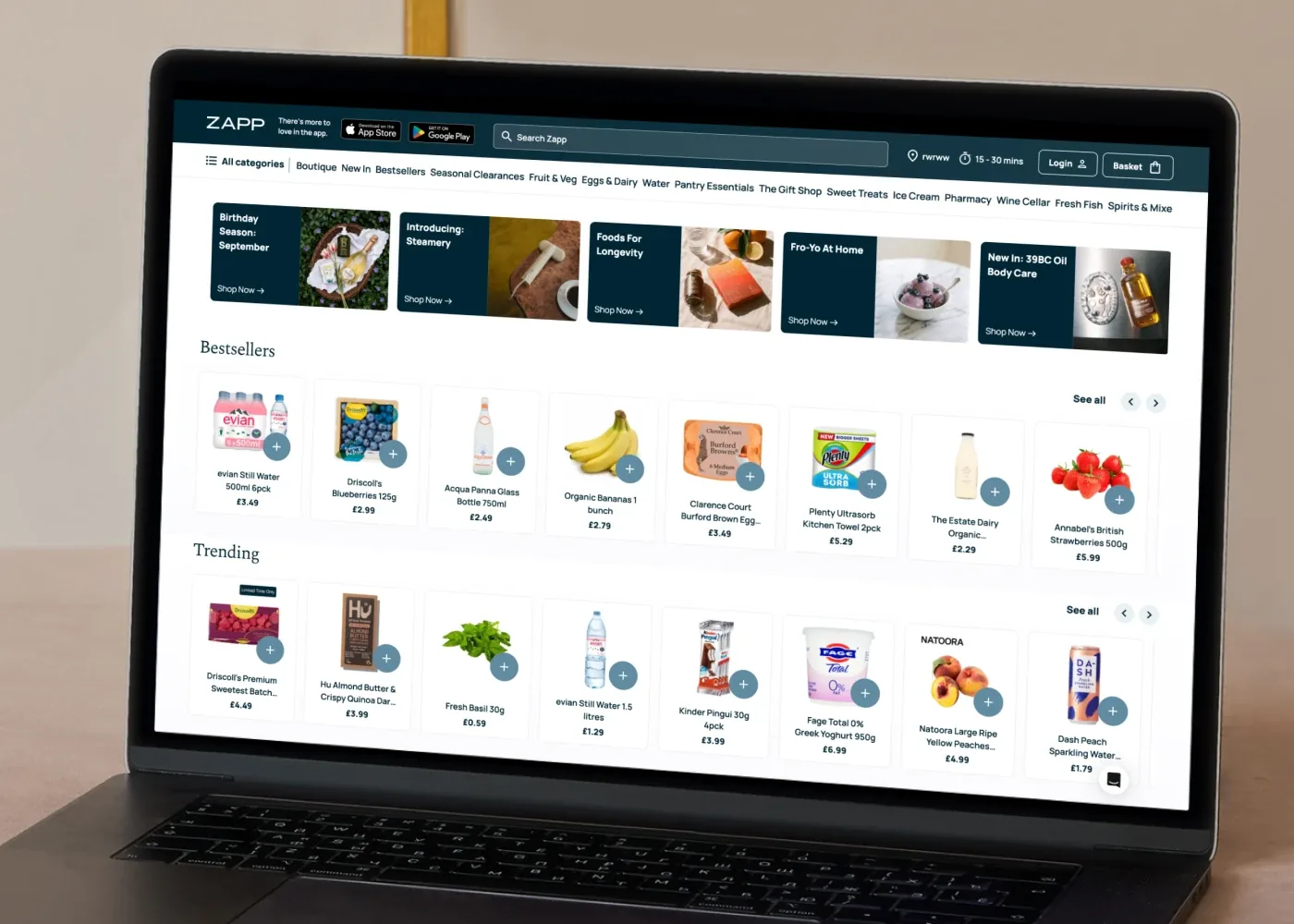
Web app
Browsing and ordering on the web: categories, editorial rails and a persistent basket.
- iOS
- Android
- Web
- Consumer
- Operational
02 — My role
My roleOwning the experience end to end, from problem to shipped screen.
Product
- Product design across Zapp's consumer and operational experiences
- Leading design direction across key product initiatives
Team
- Working closely with Product and Engineering
- Raising the quality and consistency of the product experience
Craft & tooling
- Prototyping and shipping with AI-assisted design-to-code workflows
- Grounding decisions in the field, alongside store teams
System
- Building and scaling the Zync Design System
- Translating brand and visual principles into product UI
03 — Subscription conversion
Zapp+: designing the subscription funnel, from paywall to retained member
Zapp+ is the publicly launched membership. A subscription lives or dies on three moments: the paywall, where the value has to be unmistakable; the join step, where friction has to disappear; and everything after sign-up, where the value has to keep showing up so the first bill arrives with a reason attached.
I worked the membership end to end: the paywall and join flow, the manage flow, the member-only states that change how the app behaves once you're subscribed, and the moments throughout the journey where a member's value is reflected back — the retention side of the same funnel.
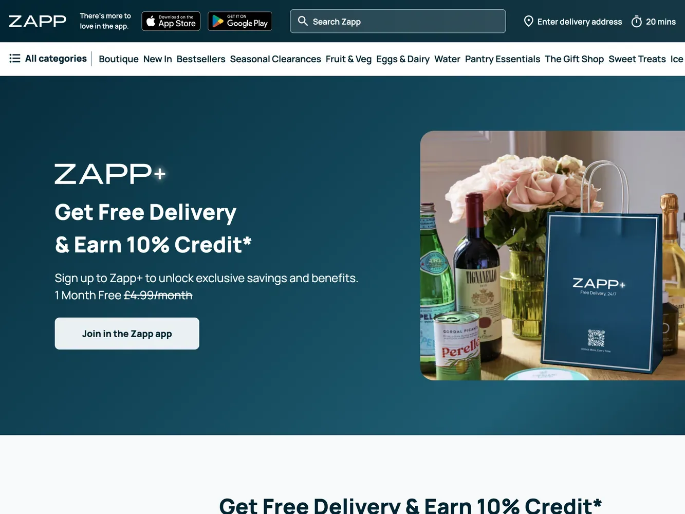
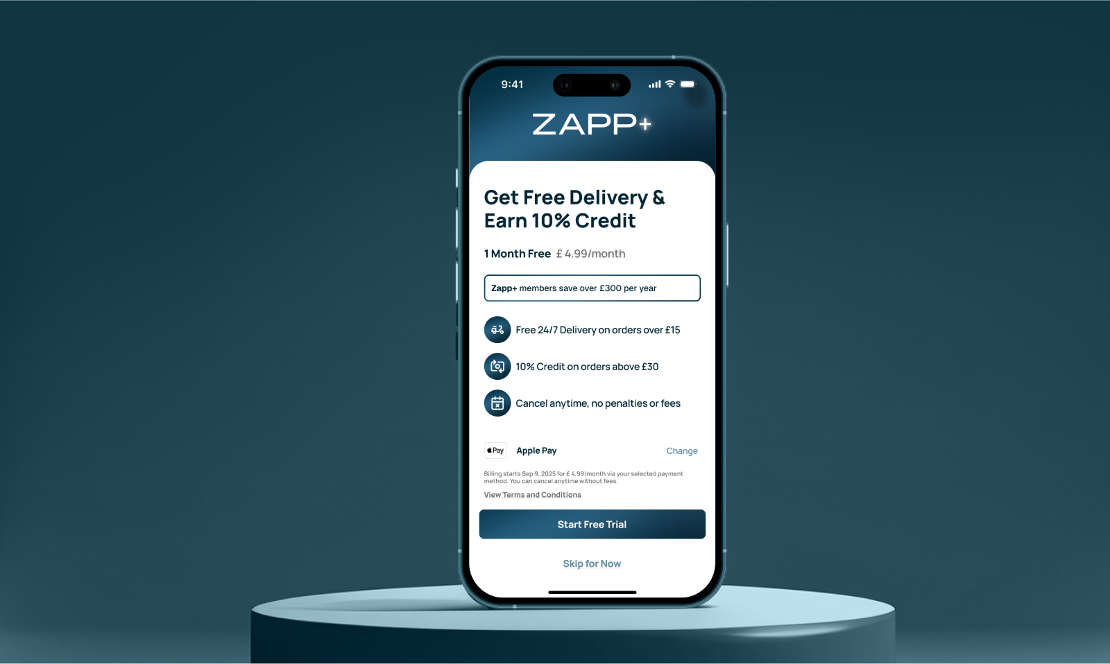
Hierarchy is a conversion lever.
On a paywall, comprehension is conversion: if the value isn't understood in one pass, the decision is deferred and usually lost. The hierarchy had to make the proposition instantly legible while staying consistent with the wider product.
- HierarchyThe benefit headline leads, the price sits directly beneath it, and the supporting terms step down in weight, so the decision is readable in one pass.
- TypographyOne scale carries the proposition, the benefit rows and the fine print, so emphasis comes from weight and size rather than new styles.
- SpacingEach benefit is a consistent row with a fixed icon column, giving the list a predictable rhythm.
- CTAA single full-width primary action, with the secondary option demoted to a text link rather than a competing button.
- ConsistencyIcon chips, cards and buttons come from the same component set used across the rest of the product.
-
Free deliveryOn qualifying orders, around the clock.
-
Credit backOn larger shops — value that returns to members.
-
Member-only statesThe app adapts once you join — pricing, delivery and prompts reflect membership.
-
Frictionless to joinFirst month free, cancel anytime — sign up in seconds with Apple Pay.
Value that keeps showing up after sign-up.
Retention is decided in the moments after the paywall. This is checkout as a member: the credit earned on this order sits on the order itself, at the point of decision, rather than in a settings page.
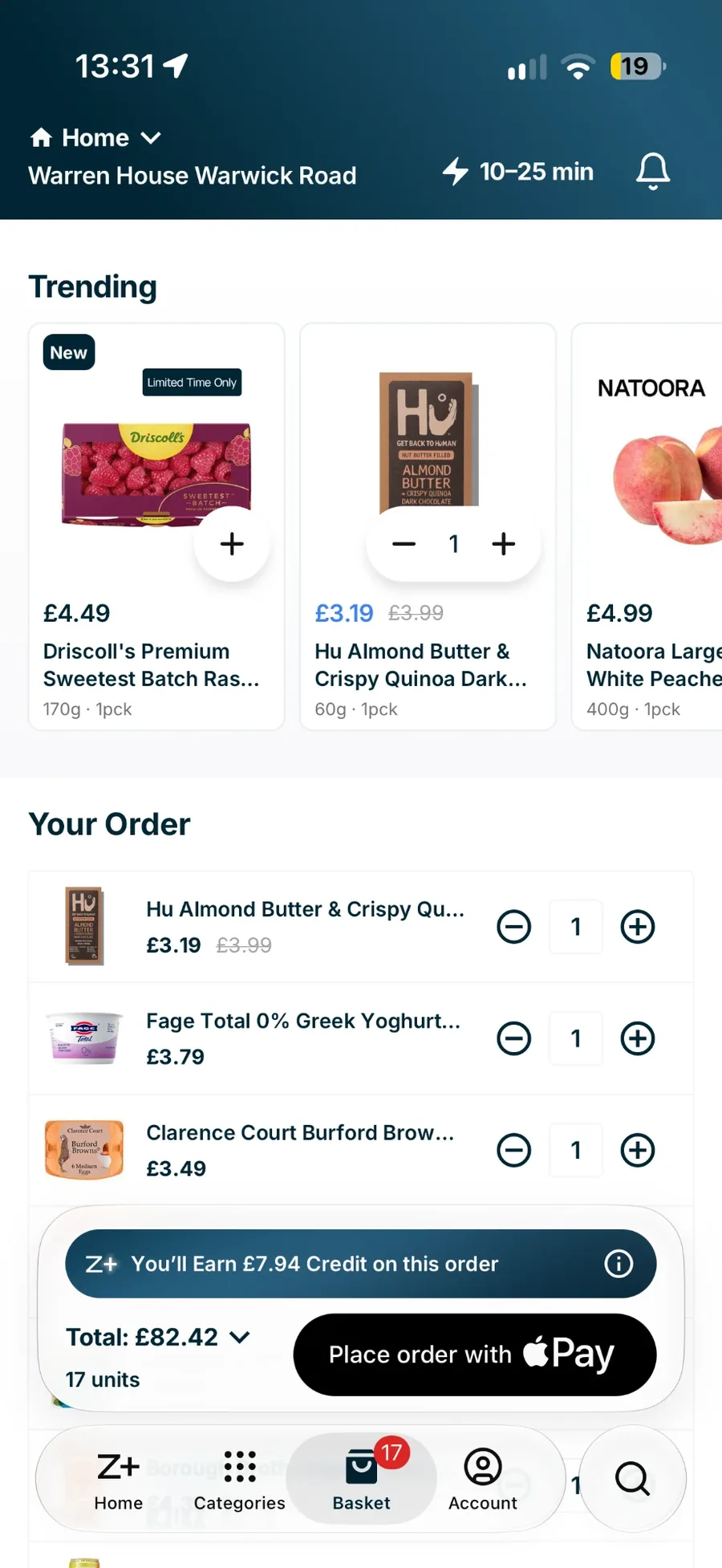
- Value reflected back"You'll earn £7.94 credit on this order" sits between the basket and the total, at the moment the decision is made. The membership proves its value in the checkout, every time.
- Member stateThe tab bar carries Z+ in place of Home: once subscribed, the app reads as a member's app, not the same app with a badge.
- One decision, one action"Place order with Apple Pay" is the single primary action, with total and units beside it. Nothing competes with completing the order.
Zapp+, in numbers.
The value the join screen has to make unmistakable, and what every hierarchy decision on it is in service of.
by an average member
on orders over £30
on orders over £15
- Join conversionsaw the paywall → subscribedLever: benefit headline first, price directly beneath it, one full-width action. The decision is readable in a single pass.
- Month-one retentionfree month → still a memberLever: member-only states and the savings card in order tracking, so value keeps showing up before the first bill.
- Time to joinopen paywall → confirmedLever: Apple Pay as the default, terms stepped down in weight, the secondary option demoted to a text link.
These are the metrics the work is judged on. They are measured internally; figures available under NDA.
04 — Behaviour-led redesign
Order trackingSolving the most anxious moment after purchase — and the one that drives support contacts.
The problem. The moment right after you order is the most anxious in the whole experience — where's my order, and when will it actually arrive? The old tracking screen answered that unevenly: the status was ambiguous, the ETA didn't feel trustworthy, and there was no single, calm place to follow a delivery from prepared to doorstep.
Make status instantly legible
A plain-language headline does more work than a progress bar alone.
Build trust through the ETA
A tight, honest time window earns more trust than an optimistic single time that slips.
Reduce cognitive load while waiting
Detail expands on demand, so the default view stays calm from prepared to delivered.
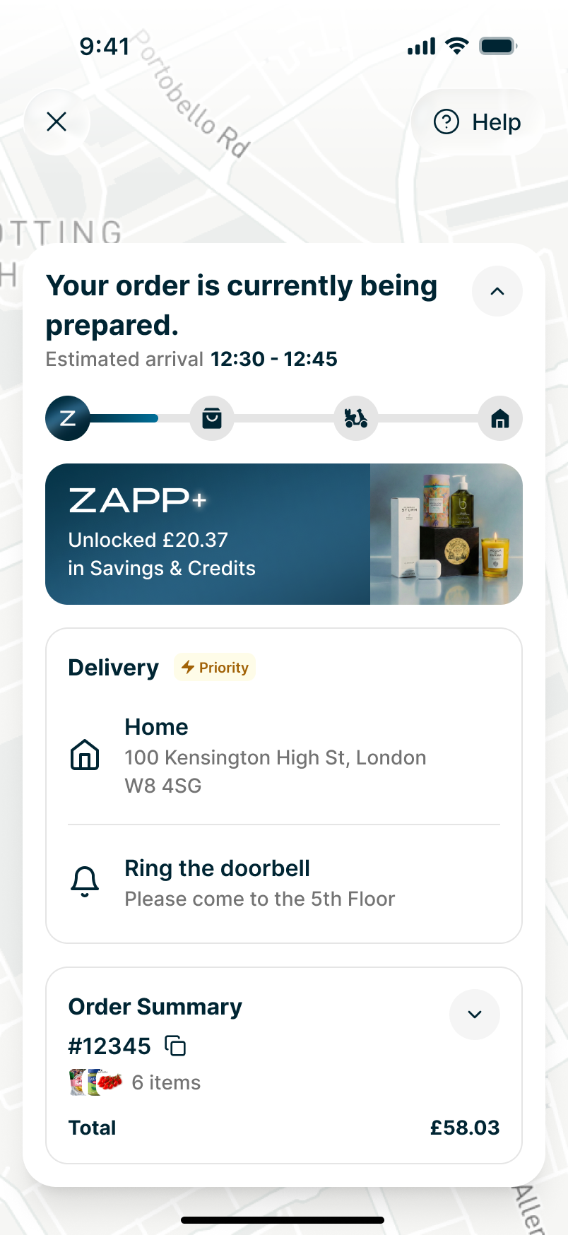
Being prepared: status & ETA window
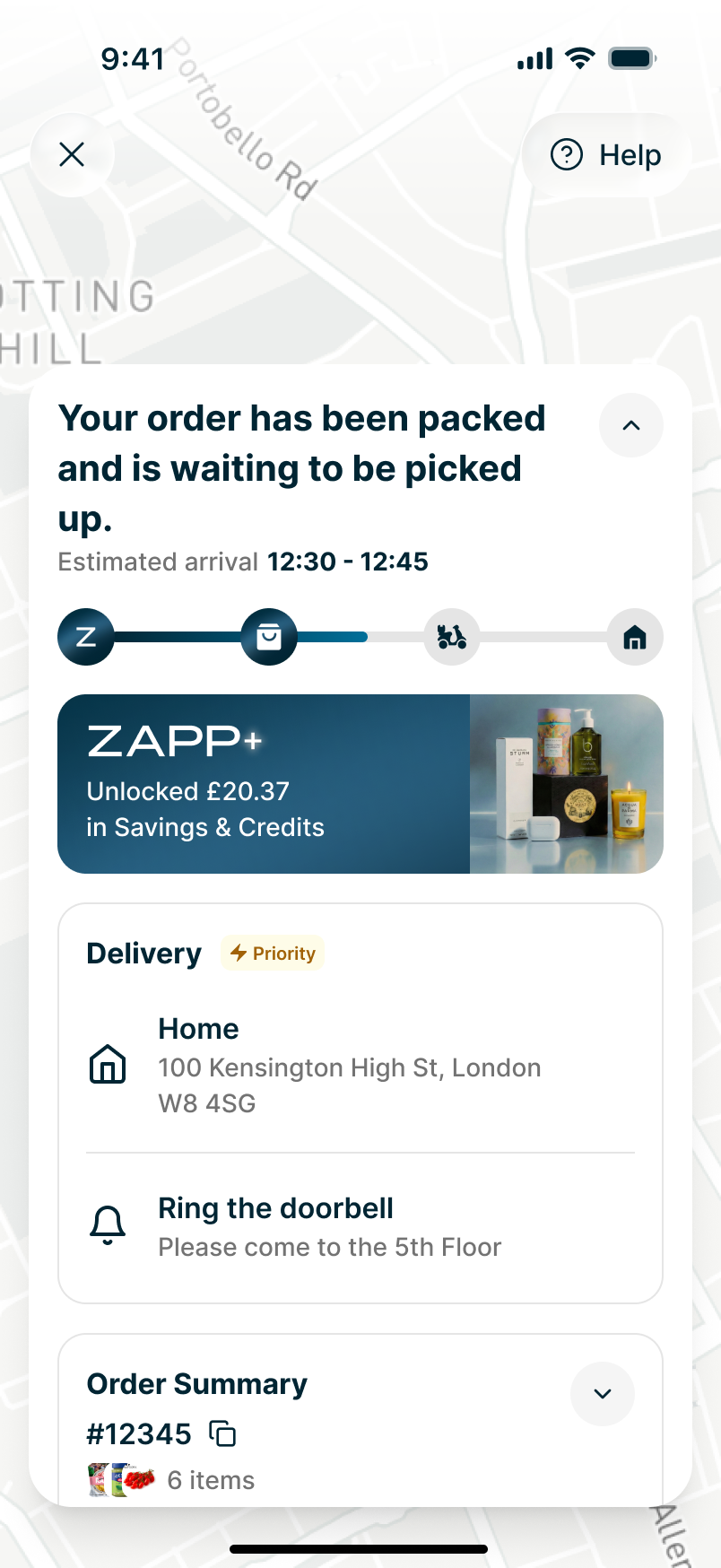
Packed & waiting for a rider
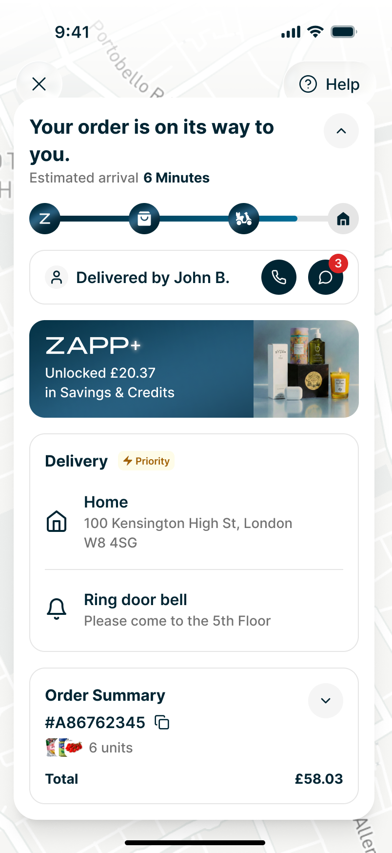
On its way: rider identity & contact
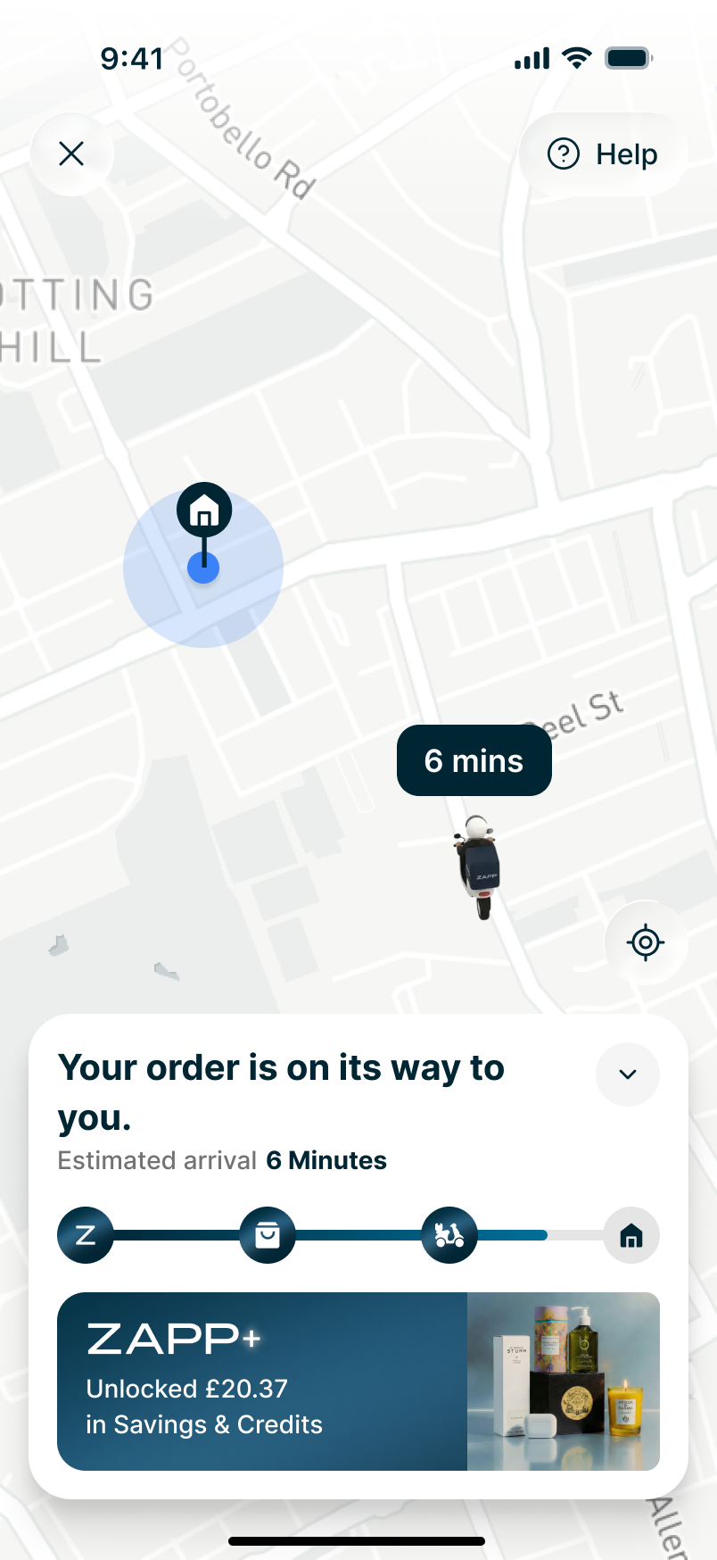
Live map with a real-time ETA
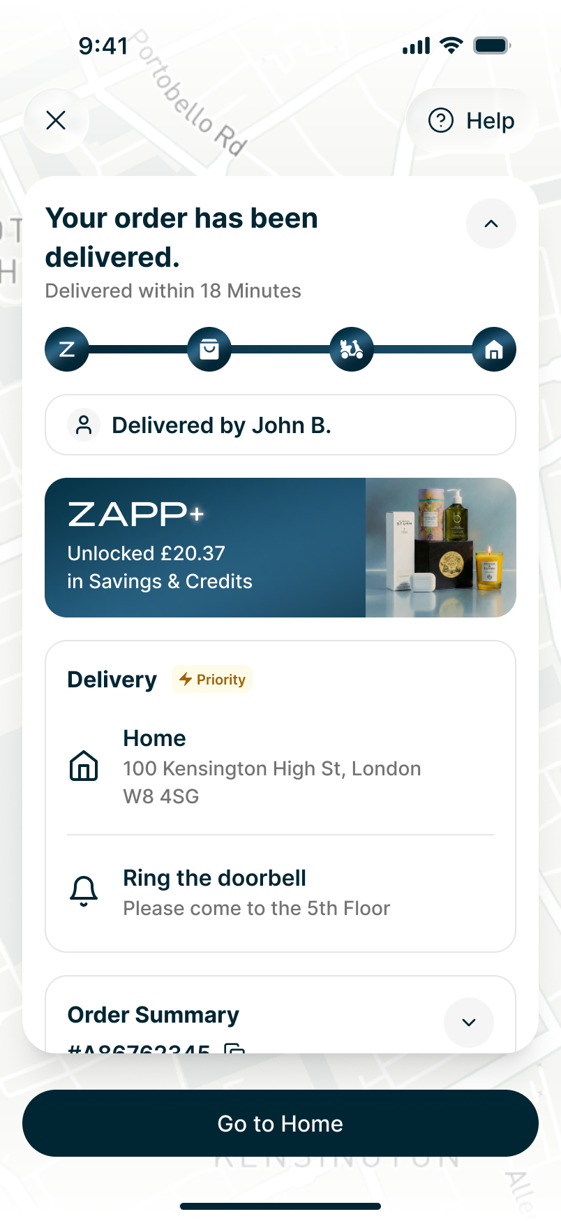
Delivered: Zapp+ value surfaced
- Status hierarchy"Your order is on its way to you." leads the card — plain language, largest weight, no competing element above it.
- ETAThe estimated arrival sits immediately below the headline in a lighter weight: supporting the answer, not competing with it.
- ProgressA four-stage tracker (Zapp, packed, rider, home) makes the current stage readable without reading any text.
- InteractionRider identity is paired with call and message actions, so contact is one tap from the status rather than buried in a menu.
- Progressive disclosureDelivery details and the order summary sit below, collapsed by default, keeping the top of the screen calm.
User behaviour analysis & research
I grounded the redesign in real behaviour rather than assumptions — looking at where customers dropped into support to ask "where is my order?", mapping how an order actually moves (prepared → packed → picked up → delivered), and testing early flows to see which signals people genuinely trusted. The recurring theme was simple: people don't want more data, they want certainty and honesty.
- Status has to be legible at a glance — a plain-language headline does more work than a progress bar alone.
- A tight, honest ETA window builds more trust than an optimistic single time that slips.
- The rider is a person, not a dot — identity and a way to make contact take the edge off the wait.
- Value belongs here too, but quietly — the Zapp+ savings should reassure, never get in the way of the core question.
The outcome. One calm, trustworthy screen that carries a customer from "being prepared" all the way to "delivered" — built from the same components, type and spacing as the rest of the product, so every state feels like one screen changing meaning rather than five different screens.
05 — Design engineering
From Figma to a working build, on a real device.
I wanted to reduce the distance between the design decision and the shipped experience.
I build Zync's components in code — with Claude, inside Storybook — not only in Figma. It collapses the gap between design and engineering: pixel-perfect execution with no developer interpretation, and nothing lost in hand-off. I assemble entire features from real, production-grade components and demo them live from my own iPhone.
 FigmaSource of truth: tokens, components, variants
 ClaudeComponents written in code, tokens intact
 StorybookDocumented and testable in isolation
 GitHubVersioned and reviewed like product code
 Expo · iPhoneThe real thing, running on a device
The goal wasn't automation for its own sake. It was to make the connection between design and implementation tighter, and allow design decisions to be evaluated in a real environment earlier.
06 — Where this is going
Design, systems and AI are becoming one workflow.
- 01 Product Define the problem and the decision worth making.
- 02 UI craft Set the quality bar: hierarchy, type, spacing, states.
- 03 Design system Encode the decision so it holds across surfaces.
- 04 Code Build it as the real thing, not a representation.
- 05 AI-assisted iteration Evaluate and refine against the actual experience.
I see AI as an extension of the design process rather than a replacement for design judgement.
The designer's role becomes even more important in defining the problem, establishing quality, making decisions and maintaining coherence across the system.
07 — Design system
ZyncThe system behind the quality.
The challenge wasn't simply to create a component library. It was to create a shared visual and interaction language that designers and engineers could actually use.
- v1.0 · Sep 2025
- Atomic Design
- React · React Native
- iOS · Android · Web
- Consumer & operational
The foundations
Built atomically, from colour and type tokens up through components and patterns to full ordering and operational screens, so consumer and operational surfaces share the same primitives across iOS, Android and Web.
Zapp brand colour tokens: a single 50–950 scale, the atomic foundation every Zync component builds on.
A clearer hierarchy across product surfaces
One scale shared by consumer and operational screens, so emphasis is consistent wherever you are.
Predictable rhythm and alignment
Shared spacing primitives give every card, row and control the same underlying grid.
Repeatable decisions instead of one-off solutions
Each component carries its own variants and states, so behaviour travels with the visual.
From components to behaviour.
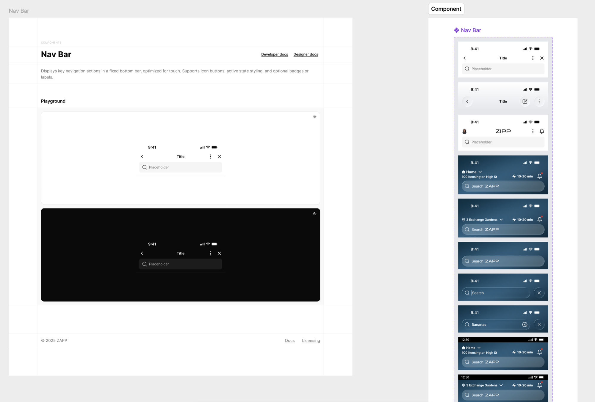
A component isn't finished when it looks right in one state. Zync components are documented with a light and dark playground, their full variant set, and both developer and designer specs, so the same decision holds wherever it's used.
- DefinitionEvery component opens with what it does and where it belongs, before a single variant is shown.
- PlaygroundLight and dark are documented side by side, so theme behaviour is part of the component rather than an afterthought.
- VariantsThe Nav Bar carries its full set (title bars, search, address and notification states) instead of a single default.
- Icon alignmentLeading and trailing actions sit on a fixed grid, so icons stay optically aligned across variants.
- Two audiencesDeveloper docs and designer docs sit on the same page, which keeps one definition rather than two interpretations.
- Variants
- States
- Light & dark
- Spacing
- Icon alignment
- Documentation
From individual decisions to reusable decisions.
The clearest way to raise the bar is to stop re-deciding. A pattern proven in a real product surface becomes a governed component, and every surface built afterwards inherits that quality by default.
Making quality scalable.
A design system doesn't create quality on its own. The team needs shared principles, strong critique and clear examples of what good looks like.
Clear visual and interaction standards
A written bar for hierarchy, type, spacing and states that a decision can be measured against.
Specific, actionable feedback
Focused on improving the work rather than imposing personal taste.
Reusable components and patterns
That encode good decisions, so the next screen starts from a higher baseline.
08 — The challenge
The challenge wasn't only consistency. It was quality.
As the product evolved quickly, different teams and product areas were solving similar UI problems in different ways. The result was increasing fragmentation, not only in components and patterns but in the overall quality and feel of the experience.
How do you raise the UI quality bar without slowing down a fast-moving product organisation?
Different audiences, different densities, different rhythms, all expected to read as one product.
Create stronger visual foundations
Establish the typography, colour and spacing decisions everything else inherits.
Turn good decisions into reusable systems
Encode a decision once as a component, rather than re-solving it per screen.
Make quality scalable across teams
Shared principles, critique and clear examples so quality doesn't depend on one person.
09 — Craft
Raising the UI bar
I wanted to move beyond polishing individual screens and establish a clearer, more consistent visual language that the team could reuse.
Visual foundations
- Typography
- Colour
- Spacing
- Hierarchy
- Iconography
Interaction quality
- States
- Feedback
- Transitions
- Component behaviour
Component quality
- Reusable patterns
- Clear variants
- Consistent behaviour
- Scalable structure
Shared standards
- Design critique
- Clear principles
- Reusable examples
- Design–engineering alignment
- HierarchyThe status headline sits at the top of the card and carries the most typographic weight. It answers the question before anything else is read.
- TypographyA tight set of sizes and weights separates status, supporting detail and metadata without introducing new styles per screen.
- SpacingConsistent rhythm between grouped blocks (status, membership, delivery, summary) so each unit is scannable on its own.
- ComponentsCards, list rows, badges and the progress tracker are shared components rather than screen-specific layouts.
- StatesThe same layout carries every stage of the journey, so the screen changes meaning without changing shape.
- Hierarchy
- Typography
- Spacing
- Components
- States
- Consistency
10 — Brand
From brand to product
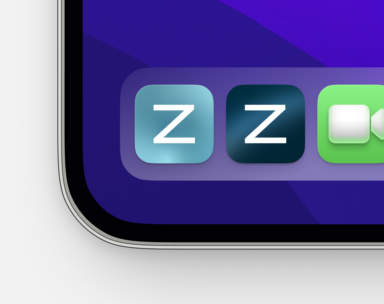
Translating the refreshed Zapp brand into a coherent product language.
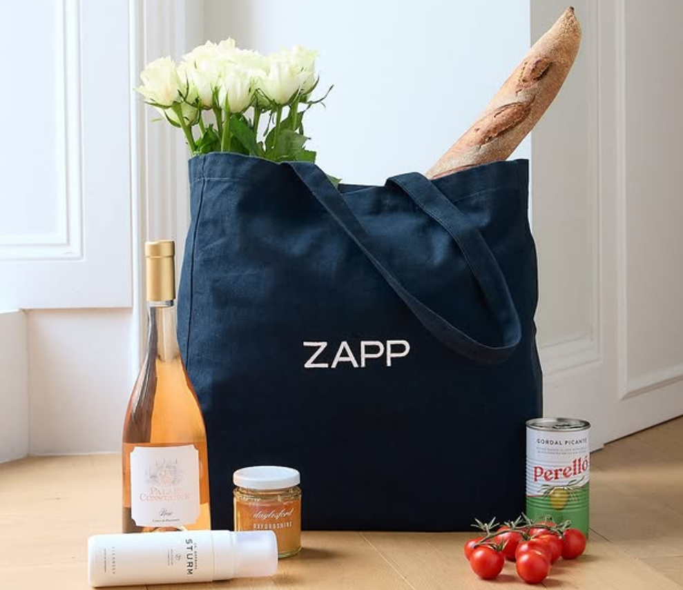
- Identity
- Typography
- Colour
- Product language
11 — Operational design
Designing beyond the consumer experience.
- Complex operational workflowsInbound, allocation, picking, packing and rider hand-off, each with its own density and pace.
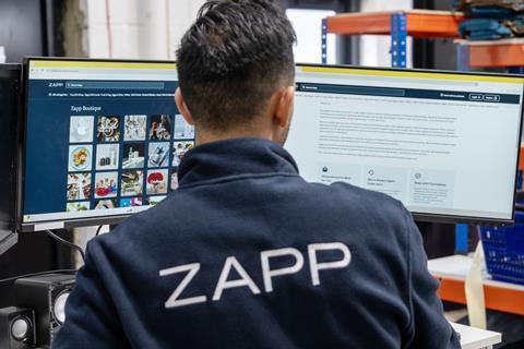
- Designing for speed and clarityBuilt for people who can't stop to puzzle over an interface mid-shift.
- Field research informing product decisionsStore visits and shadowing shaped the tooling more than any assumption made at a desk.
12 — Additional work
Additional workSupporting brand and campaign work across the same visual language.
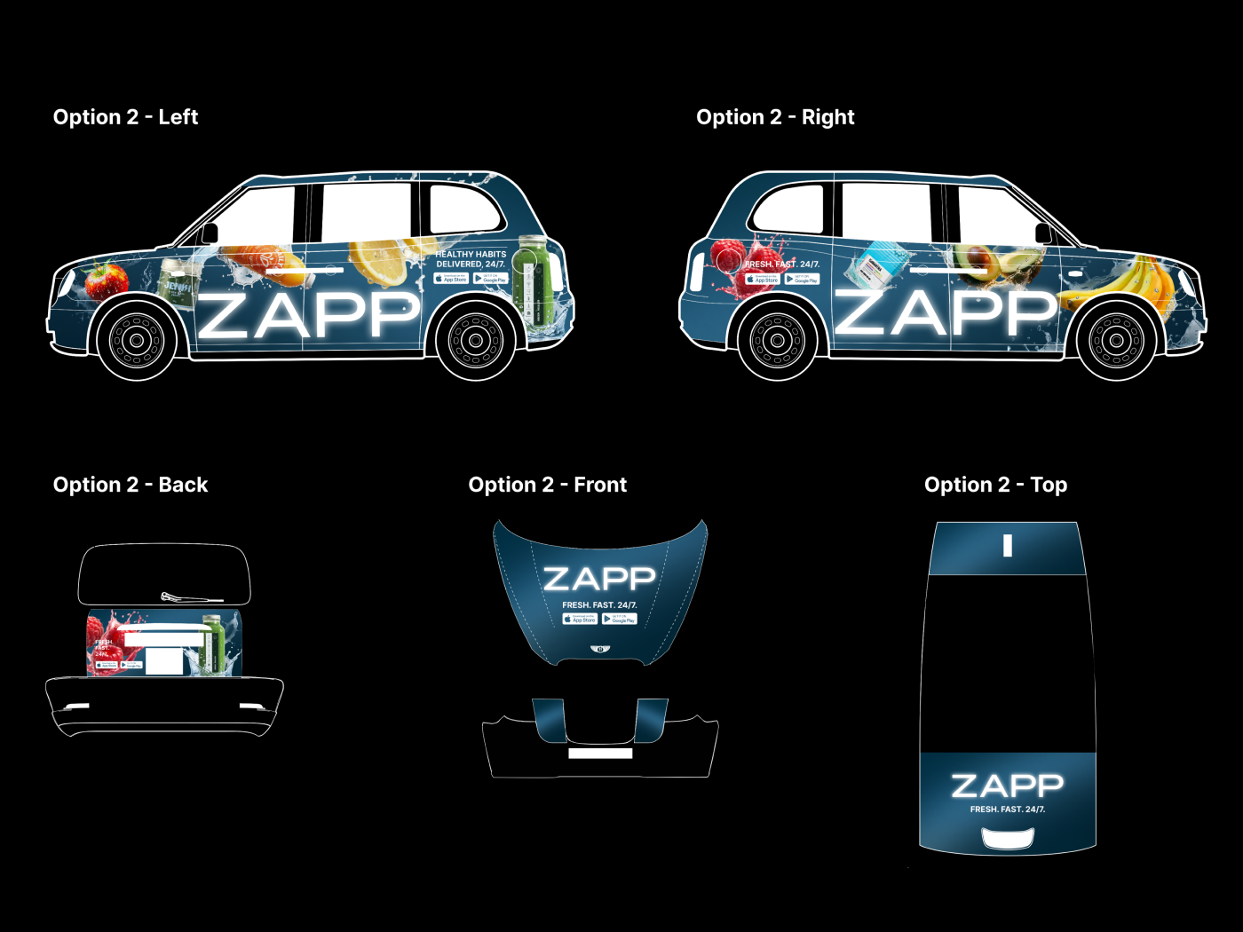
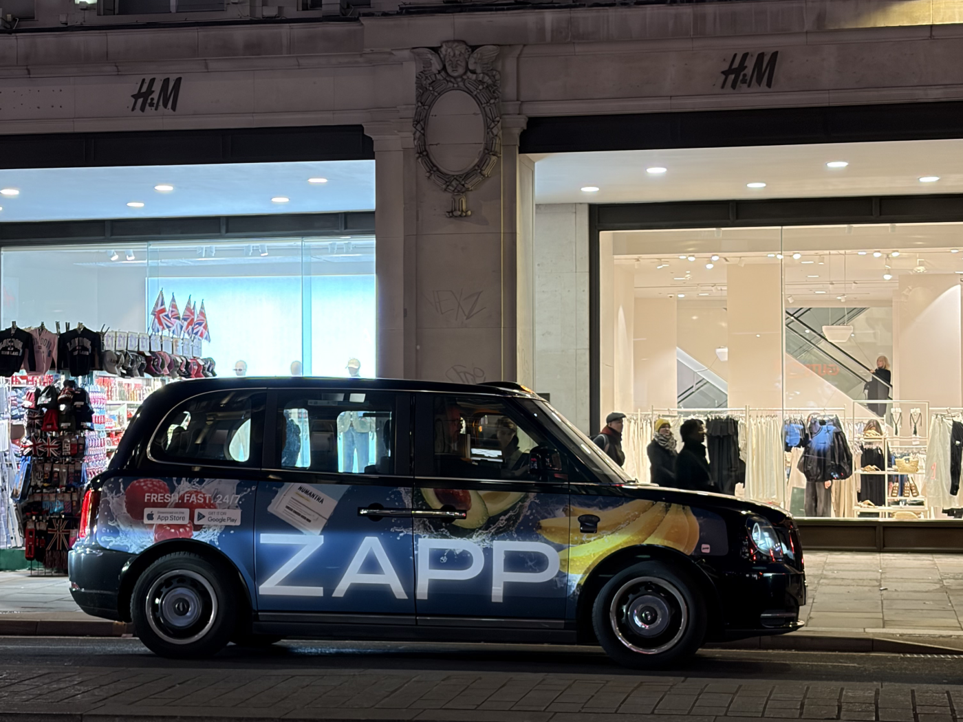
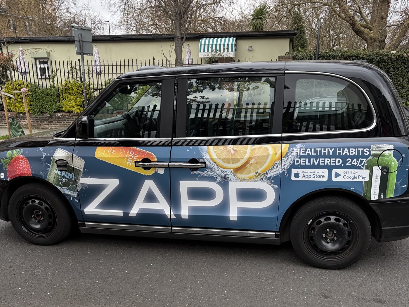
Current engagement. Zapp is my current employer, so this page covers only publicly visible work and describes the craft rather than internal detail. Deeper product, design-system and performance specifics are available on request, under a confidentiality agreement.
